Submitted about 5 years ago
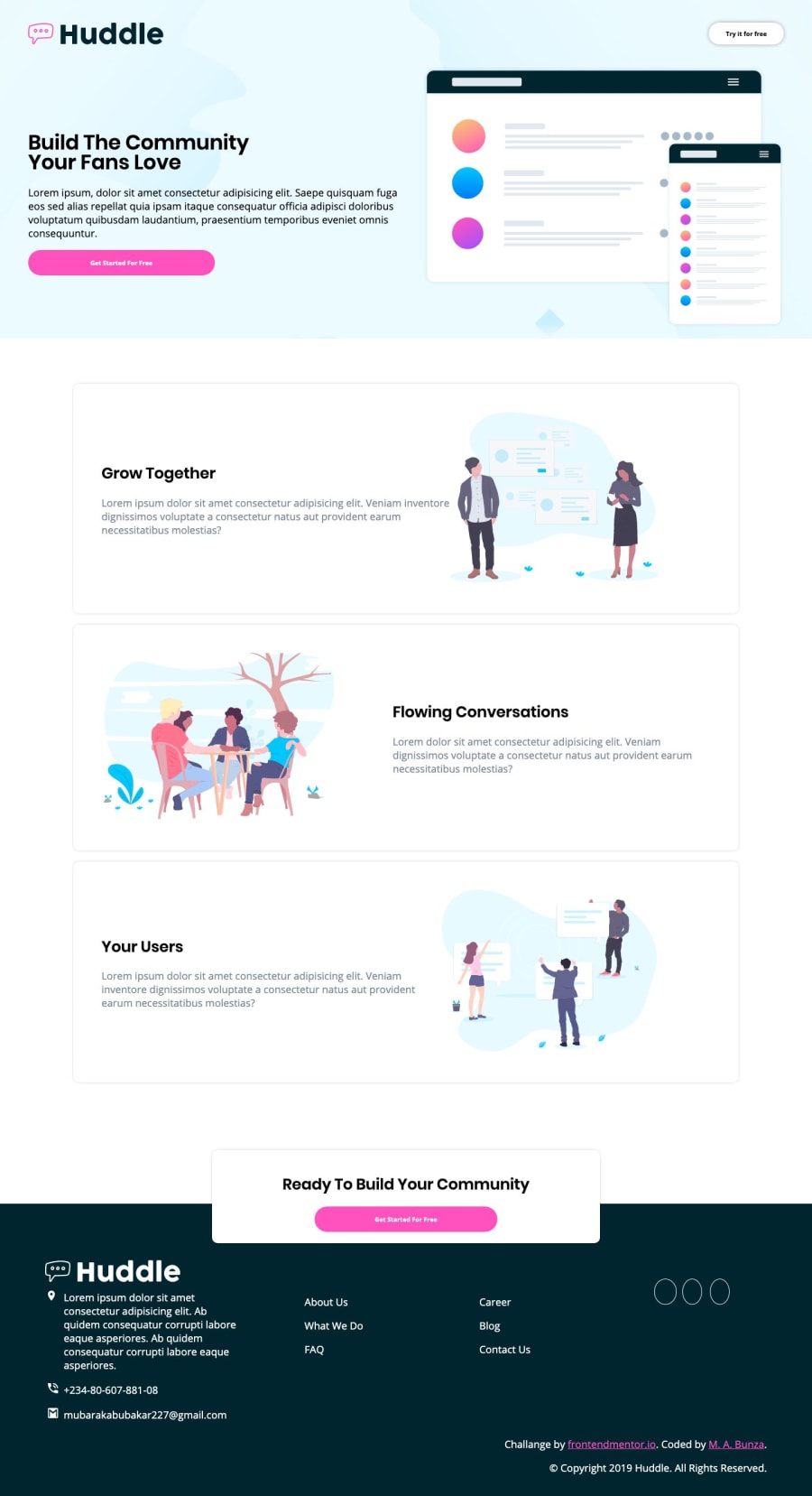
Huddle Landing Page with alternating feature blocks using CSS Flex-Box
@mubarak-bunza
Design comparison
SolutionDesign
Solution retrospective
Please leave some feedback on the layout.
Community feedback
- @mohammedalitestPosted about 5 years ago
but why u not use the font required in style-guide.md but your work looks great ..
1@mubarak-bunzaPosted about 5 years ago@mohammedalitest have uploded the changes.
0 - @argelomnesPosted about 5 years ago
Hi..
Good work with the layout. One suggestion is to remove
height: 100%;from your images so they'll scale proportionally.0@mubarak-bunzaPosted almost 5 years ago@argelomnes thank you for your feedback, i have push the changes, you can view the solution again.
0 - @MOHAMMED-ABD-RAZAQPosted about 5 years ago
great work bro .. keep moving
0
Please log in to post a comment
Log in with GitHubJoin our Discord community
Join thousands of Frontend Mentor community members taking the challenges, sharing resources, helping each other, and chatting about all things front-end!
Join our Discord
