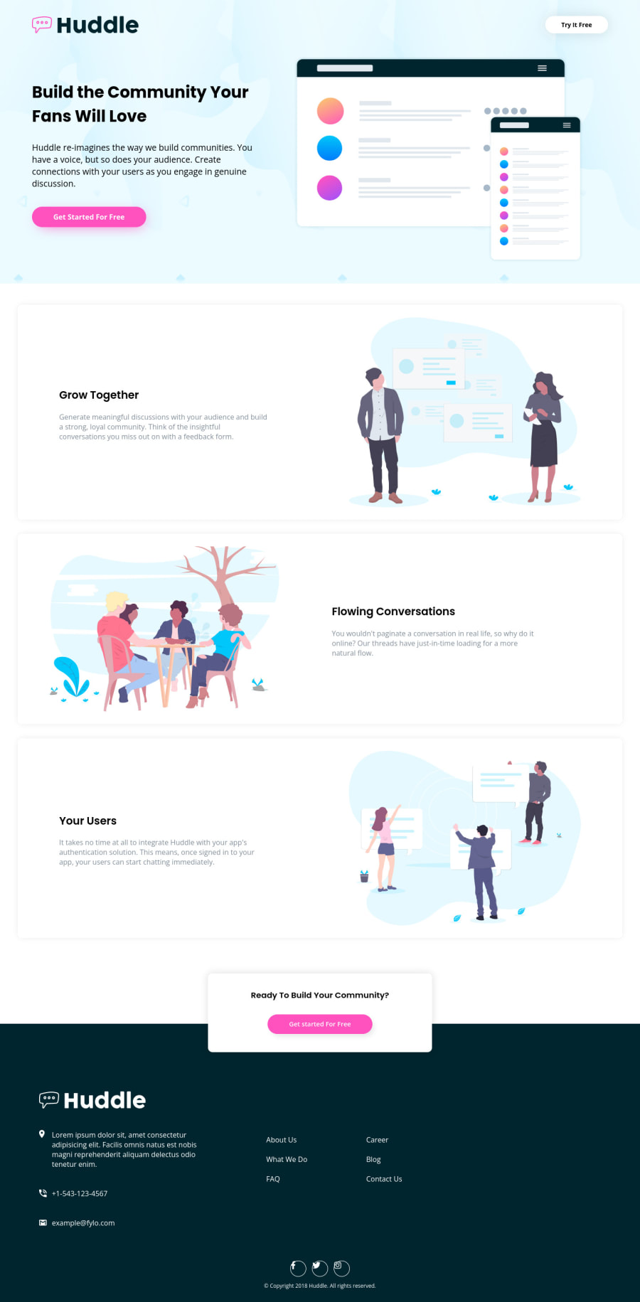
Not Found
Not Found
Not Found
Not Found
Not Found
Not Found
Not Found
Not Found
Not Found
Not Found
Not Found
Not Found
Not Found
Not Found
Not Found
Not Found
Not Found
Not Found
Not Found
Not Found

Submitted

Huddle Landing Page With Alternating Feature Blocks

Toni 420

@ToenSh


Design comparison


SolutionDesign

Solution retrospective


Hi, this was my first time trying out a junior project and I struggled a bit with it. Mostly trying to position the little card (advertisement) just before the footer and make it responsive but managed to find something to make it work (would love to hear if it's a good solution or if there is something better that can be done), Also laying out the footer itself especially on the desktop design was a bit challenging. I think my CSS for it is a little redundant but i guess it works. Finally the social icons aren't displayed in the center of their borders in my GitHub pages deployment but are centered on my vs code live server and I couldn't find a way to fix it. Would love to hear any feedback on how I can improve my code further! Thanks!

Community feedback

Elaine 11,400

@elaineleung

Posted

Hi Toni, great job in your first attempt at a Junior level project, and I think this looks well put together! 😊

About the questions you asked, I'll try to answer a few here:

  1. The ad box width: What I would do is to use min() in the width, as this allows the browser to find the best max width depending on the container width. This is what I'll write:

     // starting mobile view
    
    .get-started {
        width: min(100% - 2rem, 25rem); // 2 rem equals to 1 rem left and right margins combined
        margin-inline: auto;
    }
    
    @media (min-width: 700px) {
         .get-started {
            width: min(70%, 35rem); // You can experiment with these values to see what works
        }
     }
    
  2. Centering social icons: What I'd do is to wrap the icons with an a tag and turn those them into circles (I also would use <a> tags wrapped around the spans):

     // HTML
    <span class="social-class-circle">
       <i></i>
    </span>
    
     // CSS
    .social-icons-circle {
       display: grid;
       place-content: center;
       border: 1px solid #fff;
       width: 2.25rem;
       height: 2.25rem;
       border-radius: 50%;
     }
    
  3. Lastly, I notice that on large screen sizes the content tends to stretch out a bit. I suggest adding a .container in each of the landmark sections (i.e., header, main, footer) where you'd add a .container as a direct child and place all the content of that landmark section inside. That way you can easily adjust and control the width of all the content and get it to be aligned!

Hope this helps you out a bit, and good luck 😊

1

Toni 420

@ToenSh

Posted

@elaineleung Thanks a lot for taking the time, this was really helpful!

0

Please log in to post a comment

Log in with GitHub
Discord logo

Join our Discord community

Join thousands of Frontend Mentor community members taking the challenges, sharing resources, helping each other, and chatting about all things front-end!

Join our Discord