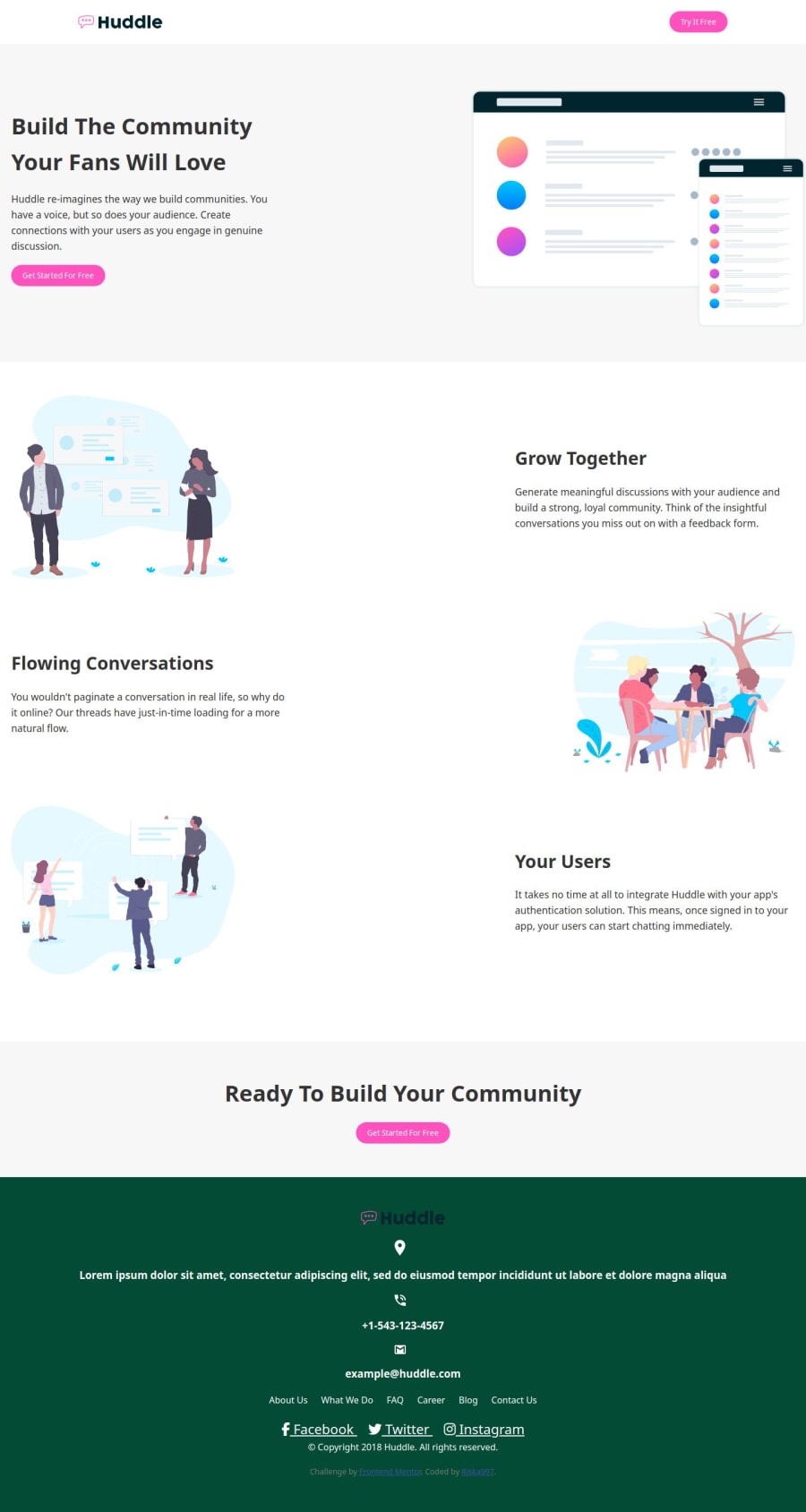
Huddle landing page with alternating feature blocks master using grid
Design comparison
Solution retrospective
Nothing. Next time I want to try using another web development language.
What challenges did you encounter, and how did you overcome them?The challenge I encountered was making the web page accessible on all devices. The challenge was not completely resolved as part of the screen is still not properly viewed on a desktop device.
What specific areas of your project would you like help with?I'd like specific feedback on the responsiveness of my Huddle landing page with alternating feature blocks. Specifically, I'm concerned about the accessibility of the .intro section across all screen sizes and orientations. Additionally, I'm seeking guidance on improving the margins and paddings throughout the design to enhance its visual appeal and usability.
Join our Discord community
Join thousands of Frontend Mentor community members taking the challenges, sharing resources, helping each other, and chatting about all things front-end!
Join our Discord
