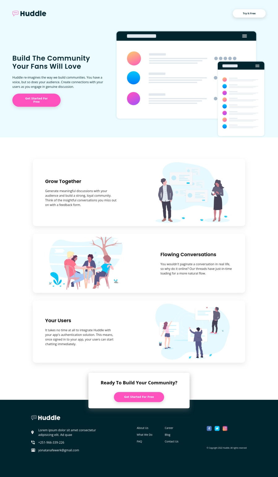
Huddle landing page with alternating feature blocks
Design comparison
Solution retrospective
I cant seem to find a way to layer the "ready to build your community?" block on top of the footer tried to use positions with relating the block with the top element and even making it self a position relative and making the footer absolute when i think about i can use the pseudo elements before and after ill try that next time any suggestions would be great its just my 3rd week i have a lot to learn.
Community feedback
- @AdrianoEscarabotePosted about 2 years ago
Hi Yonatan Afewerk Teshome, how are you?
I liked the result of your project, but I have some tips that I think you will like:
1- We have to make sure that all the content is contained in a reference region, designated with HTML5 reference elements or ARIA reference regions.
Example:
native HTML5 reference elements:
<body> <header>This is the header</header> <nav>This is the nav</nav> <main>This is the main</main> <footer>This is the footer</footer> </body>
ARIA best practices call for using native HTML5 reference elements instead of ARIA functions whenever possible, but the markup in the following example works:
<body> <div role="banner">This is the header</div> <div role="navigation">This is the nav</div> <div role="main">This is the main</div> <div role="contentinfo">This is the footer</div> </body>
It is a best practice to contain all content, except skip links, in distinct regions such as header, navigation, main, and footer.
Link to read more about: click here
2- Why it Matters
Navigating the web page is far simpler for screen reader users if all of the content splits between one or more high-level sections. Content outside of these sections is difficult to find, and its purpose may be unclear.
HTML has historically lacked some key semantic markers, such as the ability to designate sections of the page as the header, navigation, main content, and footer. Using both HTML5 elements and ARIA landmarks in the same element is considered a best practice, but the future will favor HTML regions as browser support increases.
Rule Description
It is a best practice to ensure that there is only one main landmark to navigate to the primary content of the page and that if the page contains iframe elements, each should either contain no landmarks, or just a single landmark.
Link to read more about: click here
Prefer to use
rem
overpx
to have your page working better across browsers and resizing the elements properlyThe rest is great!!
Hope it helps...👍
0 - @AbsorberendPosted about 2 years ago
Hey man,
I added the following code to your style.css file:
(after the opening @media (max-width: 63.9375em) tag) .main-plus { padding: 1em; position: relative; width: 550px; margin: 0 auto; } .main-plus-container { position: absolute; top: -50px; } (before the .main-plus .main-plus-container tag)
I gave the main-plus-container class a position of absolute and its parent (main-plus) a position of relative. I made sure that the parent main-plus class is centered on the page and matched the width with the child main-plus-container class. The only thing left to do is to give the footer a little bit of top margin and you're good I think. I hope this helps!
PS: I'm not sure if this is intended but your GitHub basically has all the files you're using to learn coding in one repository. Not sure if you want all of this open to the public. It's more common to have a repository for each project you're working on.
0@YehonatalPosted about 2 years ago@Absorberend hey i managed to do it in a similar way as well thank you for the help tho and about the Github thing yea i intended to do that my friends use it to check on my notes as well that's why its in the same repo i'll restructure everything once i start working on big projects and private the repo :)
btw another question am new to this and what do you think about how am structuring html and the other styles files?
1@AbsorberendPosted about 2 years ago@R4nn3r awesome, nice that you found out!
Atm I don't use SCSS and I honestly don't know a lot about it so I can't say for sure how your CSS should be structured. Your HTML is great imo, you sort the attributes nicely so it's nice and easy to read. You add comments as well which is great (really increases readability a ton!). You also seem to use sections and articles properly so that's good. I think you did well with the HTML at least! Good luck with the coding!
Marked as helpful0@YehonatalPosted about 2 years ago@Absorberend Thank you man am planning to move to js soon
0@AbsorberendPosted about 2 years ago@R4nn3r awesome, gl man. I struggled big time when I switched to JS until I found the following 2 courses:
- https://www.udemy.com/course/the-complete-javascript-course/ (especially the basic first few chapters, becomes less interesting after that)
- https://learnjavascript.online/
Im not affliated in any way, but this got me on my feet FAST because of how practical both are. I did them both at the same time and loved it. Just a tip for you there :)
0@YehonatalPosted about 2 years ago@Absorberend thank you for the suggestion but i cant afford any payed courses am kinda struggling i even learn programming on 8 year old Toshiba pc ill find free courses but still i really appreciate the help :)
0
Please log in to post a comment
Log in with GitHubJoin our Discord community
Join thousands of Frontend Mentor community members taking the challenges, sharing resources, helping each other, and chatting about all things front-end!
Join our Discord