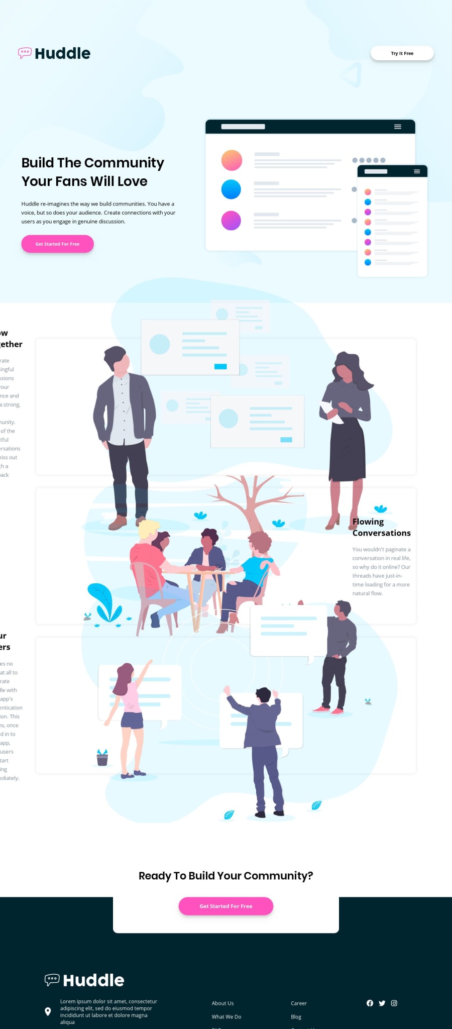
Huddle landing page with alternating feature blocks - HTML/CSS Flexbox
Design comparison
Solution retrospective
I don't know if I did it well, but I wrote a lot of lines of CSS code! haha, I'd appreciate your feedback :) Thanks!
Community feedback
- @mattstuddertPosted over 4 years ago
Nice work on this challenge, José. The layout for the feature section is off at the moment and so it would be worth reviewing that and trying to resolve it. I noticed you're using the
vwunit a lot. Is there a specific reason why you're doing this?Your intro section and footer are looking great, so once the features section is resolved it will look great!
0@jharteagaPosted over 4 years ago@mattstuddert thanks for your feedback! I don't know why the solution side shows the features section so bad haha, I click it on the preview site and it seems good, not everything piled each other. I will check it out!
Regarding the use of the "vw" unit, I'm probably wrong, I use it too much because I tried many things to make text, images, etc, resize well in responsive behaviour. I tried px, rem, but the text or images remain small when I resize the window to a bigger one. What would you recommend me? I would appreciate your tips to learn :)
0 - @adarshcodesPosted over 4 years ago
The layout is messed up, change a few things and it would be great😍. By the way, great work!
0@jharteagaPosted over 4 years ago@adarshcodes Wow! I don't know why is showing the solution like that haha, if you watch the preview site, it doesn't look like that. I'll check it! thanks for the comment buddy
1
Please log in to post a comment
Log in with GitHubJoin our Discord community
Join thousands of Frontend Mentor community members taking the challenges, sharing resources, helping each other, and chatting about all things front-end!
Join our Discord
