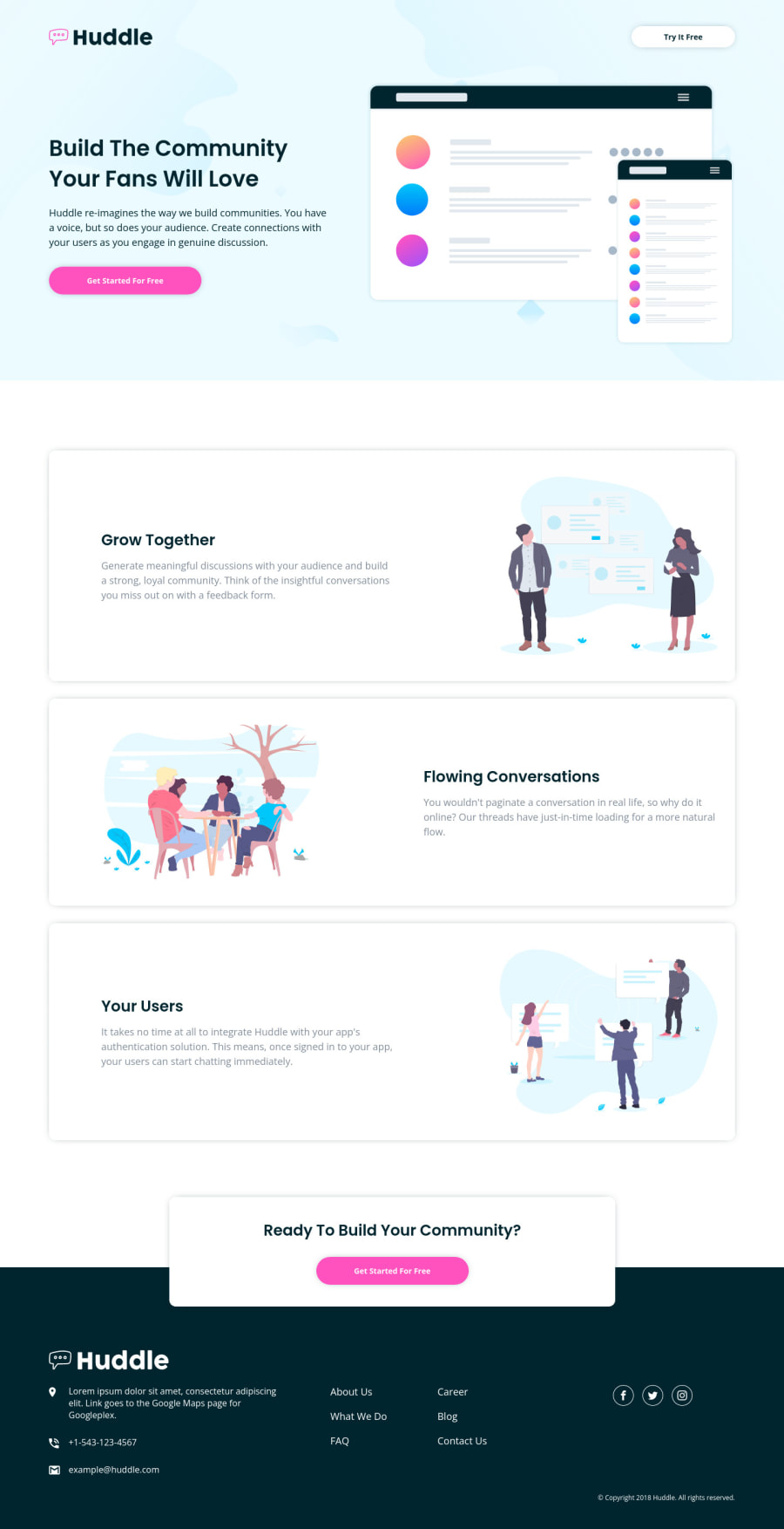
Design comparison
SolutionDesign
Solution retrospective
I tried to keep things rather basic with this project since it was my first full-page project in a long time. It took some time to wrap my head around how I was going to approach the different sections, while keeping a consistent layout. The footer was particularly challenging at first, but I think I ended up with a decent solution.
I will need to add some accessibility improvements for this project still. Feel free to reach out with any tips and feedback! Thanks!
Community feedback
Please log in to post a comment
Log in with GitHubJoin our Discord community
Join thousands of Frontend Mentor community members taking the challenges, sharing resources, helping each other, and chatting about all things front-end!
Join our Discord
