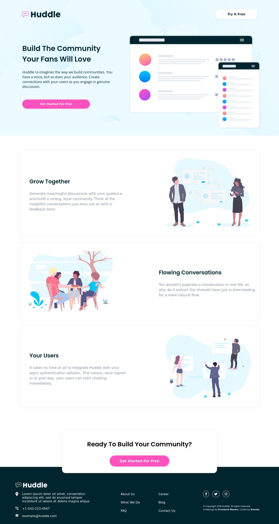
Huddle landing page with alternating feature blocks
Design comparison
Solution retrospective
I completed another web layout and found this challenge fun. Any feedback is appreciated.
Community feedback
- @denieldenPosted over 2 years ago
Hi Romila, congratulations on completing the challenge, great job! 😁
Some little tips for optimizing your code:
- add descriptive text in the
altattribute of the images - remove all unnecessary code, the less you write the better as well as being clearer: for example the
divcontainer of image - add
transitionon the element with hover effect - instead of using
pxuse relative units of measurement likerem-> read here
Hope this help! Happy coding 😉
Marked as helpful0@romila2003Posted over 2 years agoHi Daniel,
Thanks for the suggestions, I appreciate it. I changed some of my code according to what you said so thanks again.
1 - add descriptive text in the
- @rauthbituPosted over 2 years ago
Hi Romila ! congratulations on completing the challenge....
1
Please log in to post a comment
Log in with GitHubJoin our Discord community
Join thousands of Frontend Mentor community members taking the challenges, sharing resources, helping each other, and chatting about all things front-end!
Join our Discord
