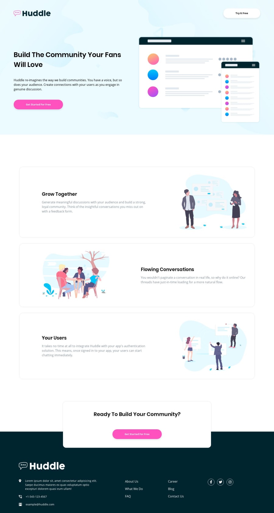
Huddle landing page with alternating feature blocks
Design comparison
Solution retrospective
I've been looking up ways to make responsive websites during this project and found that vw and vh units can be good, so decided to give them a shot. They seem to do the job, but if anyone more experienced could take a look and maybe offer some tips and/or advice, I'd highly appreciate it :)
*Also it seems like the design preview ate the bottom of my page where the copyright info is?
Community feedback
- @adarshcodesPosted over 4 years ago
Hi! @Senatrius, Nice work🙂. Let's see you solution with few aspects:
- Design aspect
- Your design looks pretty nice and like those hovering effects, just a suggestion, you can make those buttons translate to
-y-directionso that it'll look like press on the button on hover.
- Responsive aspect
- Responsiveness works nicely👍
- Code aspect
- Your code is clean and easy to understand
- Issues aroused
- Solve the HTML and Accessibility issues.
Keep Coding🐱💻
2 - @whimsicurl-creationsPosted over 4 years ago
Great job with your solution! It scales well and the hover effects are nice. Your code seems clean and well organized. I'd take a look at the accessibility and HTML issues to polish it up a bit more. Keep up the good work!
2
Please log in to post a comment
Log in with GitHubJoin our Discord community
Join thousands of Frontend Mentor community members taking the challenges, sharing resources, helping each other, and chatting about all things front-end!
Join our Discord
