Submitted almost 2 years ago
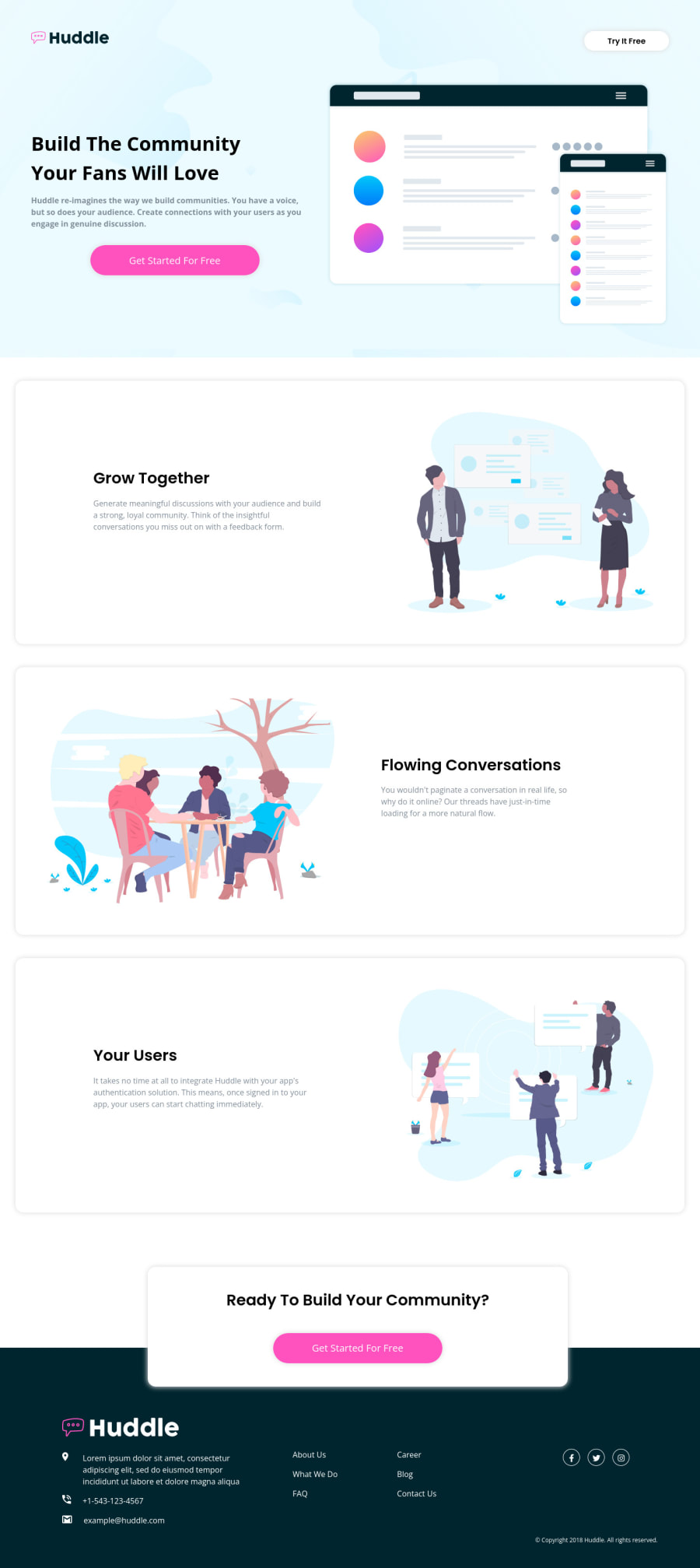
Huddle landing page with alternating feature blocks
#bem#accessibility
@shashikantdev3
Design comparison
SolutionDesign
Solution retrospective
Any recommendations, feedback and advice to improve my project or skills are welcome. :D
Community feedback
- @frank-itachiPosted almost 2 years ago
Hello there 👋. Congratulation for completing the challenge👍!
I have some suggestions about your code that might interest you.
- Your code is readable and well structure but when it comes to functionality and user experience there are some aspects we’ve got to think. For instance, according to de design in the
<footer>section there must be some links that should redirect the user to a different page that provides additional information. The About Us link is a good example. So, you should use a<a href=””>tag to achieve such purpose instead of using the<p>one. - Remember, we also gotta take into account the user experience and not only the design.
I hope you find it useful! 😄 Above all, you did a good job!
Happy
<coding />😎!0 - Your code is readable and well structure but when it comes to functionality and user experience there are some aspects we’ve got to think. For instance, according to de design in the
Please log in to post a comment
Log in with GitHubJoin our Discord community
Join thousands of Frontend Mentor community members taking the challenges, sharing resources, helping each other, and chatting about all things front-end!
Join our Discord
