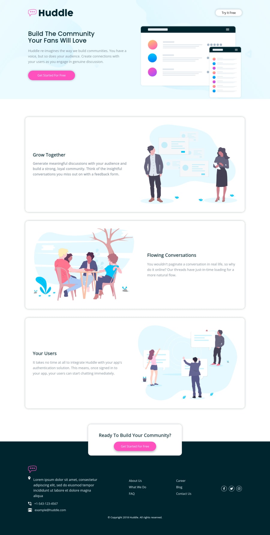
/huddle-landing-page-with-alternating-feature-blocks-master
Design comparison
Solution retrospective
I would like to see your suggestions to improve my solution
Community feedback
- @VCaramesPosted almost 2 years ago
Hey there! 👋 Here are some suggestions to help improve your code:
- Do not forgot to check your FEM report, to see what is incorrect and update your code with it before moving on to the next challenge.
- Along with the blank
alt tag
, you also want to include thearia-hidden=“true”
to your Illustrations/icons to fully remove them from assistive technology.
More Info:📚
https://www.w3.org/WAI/tutorials/images/
- The company info inside the
footer
needs to be wrapped inside anaddress
element.
More Info:📚
- The company directory needs to wrapped in a
nav
element and be built using theunordered list
element to create a single list. You will use the CSS propertycolumn
to style it.
More Info:📚
MDN <ul>: The Unordered List element
- The "copyright" is not a heading.
- Implement a Mobile First approach 📱 > 🖥
With mobile devices being the predominant way that people view websites/content. It is more crucial than ever to ensure that your website/content looks presentable on all mobile devices. To achieve this, you start building your website/content for smaller screen first and then adjust your content for larger screens.
- Your CSS Reset is extremely bare and being underutilized. To fully maximize your CSS reset, you want to add more to it.
Here are few CSS Resets that you can look at and use to create your own or just copy and paste one that is already prebuilt.
If you have any questions or need further clarification, feel free to reach out to me.
Happy Coding!🎄🎁
0 - @catherineisonlinePosted almost 2 years ago
Nice solution 🤩
To improve the code there are several tips on how you can use an alt attribute for images. If the image is just for decoration you can still write an alt attribute but leave it empty, such images don’t need any alt tag but you will need to also add aria-hidden=“true”. In this case, footer location/phone icons which are decoration. Otherwise, you need to use an alt tag to describe the image for accessibility.
According to MDN “The alt attribute holds a text description of the image, which isn't mandatory but is incredibly useful for accessibility — screen readers read this description out to their users so they know what the image means. Alt text is also displayed on the page if the image can't be loaded for some reason: for example, network errors, content blocking, or linkrot.“
IF THIS WAS HELPFUL PLEASE MARK IT AS HELPFUL 🤩
0@sohailmahmoud17Posted almost 2 years ago@catherineisonline thank you, miss I'll keep it in mind
0
Please log in to post a comment
Log in with GitHubJoin our Discord community
Join thousands of Frontend Mentor community members taking the challenges, sharing resources, helping each other, and chatting about all things front-end!
Join our Discord