Design comparison
Solution retrospective
This is going to be my last learning project using pure CSS and semantic HTML. Moving forward I'm going to be learning SASS and JS to make more responsive and cleaner designs with out the fuss of fiddling with pure unadulterated CSS.
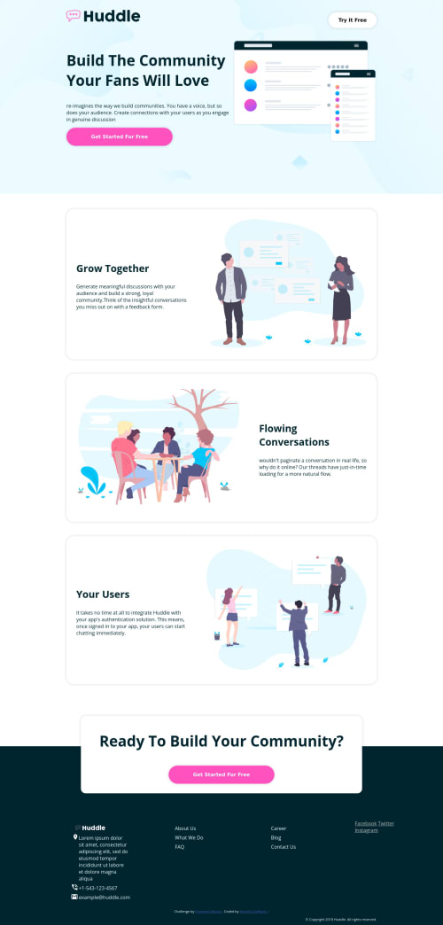
I tried my best to make all elements responsive to all screen sizes while trying to match the given design template as closely as possible.
Please dig into my code! I would appreciate all feedback given as it will help me grow into a better developer.
cheers!
Community feedback
- @VCaramesPosted almost 2 years ago
Hey there! 👋 Here are some suggestions to help improve your code:
- Since there is only a "logo" and single "button" and no "navigation menu" at the top of your site, there is no need ❌ for a
nav
element and it should be inside theheader
element.
- The
alt tag
description in the logo needs to be improved upon ⚠️. The description should state the company’s name.
- ⚠️ Remove all the
article
elements you added, they are being used incorrectly ❌.
- The “illustrations/icons” serve no other purpose than to be decorative; they add no value. Their
alt tag
should left blank and have anaria-hidden=“true”
to hides it from assistive technology.
More Info:📚
[MDN Aria-Hidden] (https://developer.mozilla.org/en-US/docs/Web/Accessibility/ARIA/Attributes/aria-hidden#description)
- ⚠️ The logo and company info inside the
footer
need to be wrapped inside anaddress
element. While each individual information needs to wrapped in ananchor
element.
More Info:📚
- ⚠️ The company directory needs to wrapped in a
nav
element and be a single list, not two. You will use the CSS propertycolumn
to style it. Each individual link needs to wrapped in ananchor
element.
More Info:📚
MDN <ul>: The Unordered List element
- It is best practice ✅ to use,
classes
for styling purposes, while usingids
solely for JavaScript.
If you have any questions or need further clarification, feel free to reach out to me.
Happy Coding! 🎆🎊🪅
Marked as helpful1@VCaramesPosted almost 2 years ago- Your
CSS Reset
is being underutilized. 😢 To fully maximize 💯 it, you will want to add more to it.
Here are some examples that you can freely use:
- Implement a "Mobile First" approach 📱 > 🖥
Mobile devices are now the dominant 👑 way in which people browse the web, it is critical that your website/content looks perfect on all mobile devices.
More Info: 📚
- For improved accessibility 📈 for your content, it is best practice to use
em
formedia-queries
. Using this unit gives users the ability to scale elements up and down, relative to a set value.
Marked as helpful1@michelestaffierePosted almost 2 years ago@vcarames Thanks for all the suggestions and looking over my project files. Ill implement your recommendations and dive into the resources you provided. Thanks!
1 - Since there is only a "logo" and single "button" and no "navigation menu" at the top of your site, there is no need ❌ for a
- @locamponievesPosted almost 2 years ago
Great job
1
Please log in to post a comment
Log in with GitHubJoin our Discord community
Join thousands of Frontend Mentor community members taking the challenges, sharing resources, helping each other, and chatting about all things front-end!
Join our Discord