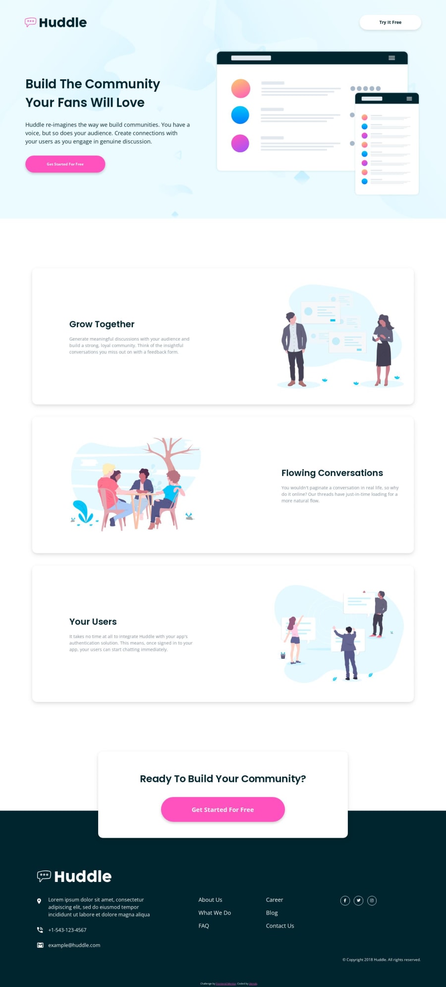


Design comparison

Solution retrospective
🦉 Hi Frontend Mentor Community!
It is my first solution to Huddle Landing Page with Alternating Feature Blocks.
Feel free to check out my codes.
My solution is just simple Vanilla HTML 🌐, CSS 🎨, and JavaScript 🟨.
Passing Lighthouse 💡🏠 basic audit for Performance ⚡, Accessibility 🧑🦯, Best Practices ✅, and SEO 🔎 for both mobile 📱 and desktop 🖥️.
I plan to finish all challenges using this approach, but I will upgrade my stacks ⚙️⚛️🌀 in the future. 💯
Follow me with my coding journey!
Happy coding! 🥰
Community feedback
- @kimodev1990Posted 11 months ago
- You could use clamp ( ) method in your coding for font-size, width, margins, paddings etc., So your designed sizes will change according to the viewport dimensions having a responsive design and will be suitable for any device layout.
Hope you find this Useful & Helpful.
Other than that, Really Nice work & keep Going on !!
Marked as helpful1@jilenskiPosted 11 months ago@kimodev1990
I checked that one out and found it really useful.
Thanks for your feedback! 😄
0

Please log in to post a comment
Log in with GitHub
Join our Discord community
Join thousands of Frontend Mentor community members taking the challenges, sharing resources, helping each other, and chatting about all things front-end!
Join our Discord