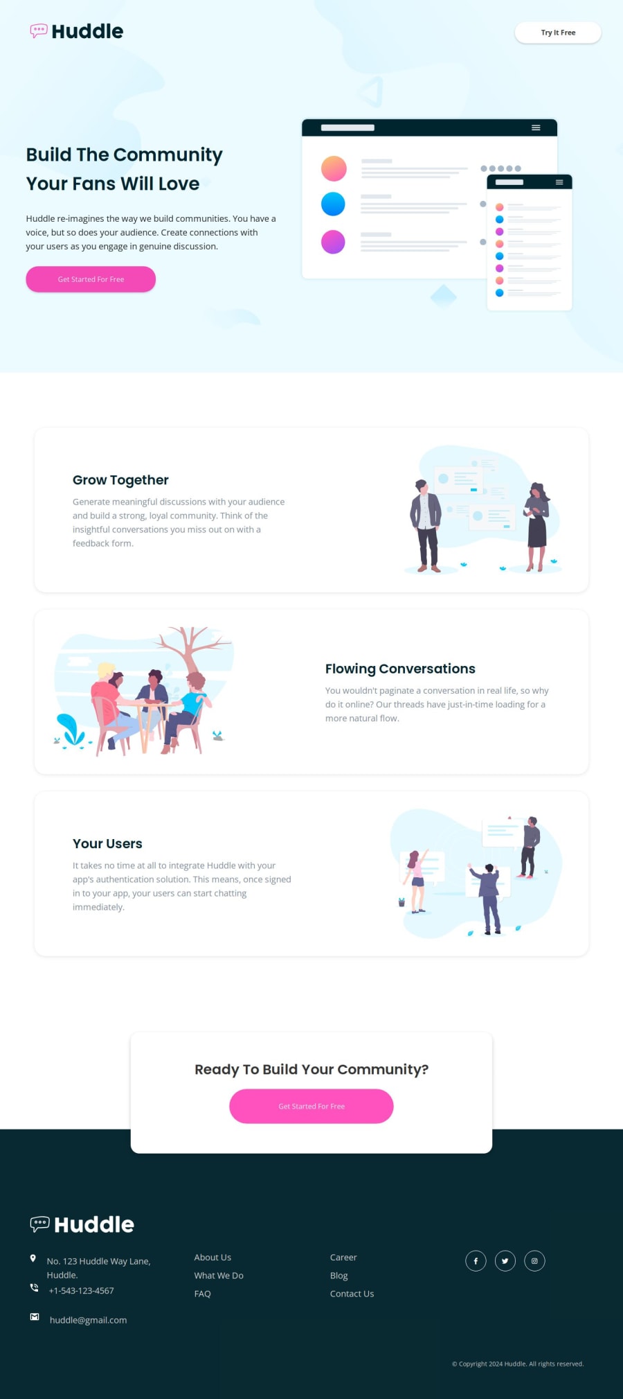
Huddle Landing Page with Alternating Feature Blocks
Design comparison
Solution retrospective
Proud of: I am most proud of the overall design and responsiveness of the Huddle landing page. The project challenged my skills in creating a fully responsive layout that looks great on various devices, and I'm pleased with how it turned out. The alternating feature blocks add a dynamic feel to the page, and the hover states for interactive elements enhance the user experience. Additionally, I am proud of the clean and semantic HTML5 structure and the efficient use of CSS Grid and Flexbox for layout management.
What I would do differently next time: Next time, I would focus more on optimizing the performance of the website. While the current implementation works well, there is always room for improvement in terms of loading speed and resource optimization. I would look into lazy loading images and minimizing CSS and JavaScript files. I would also like to explore using a CSS preprocessor like SASS to manage styles more efficiently and make the codebase easier to maintain. Furthermore, I would implement more thorough testing, including cross-browser testing and accessibility checks, to ensure a consistent and accessible experience for all users.
In summary, I am proud of the design and responsiveness of the Huddle landing page, but in future projects, I would prioritize performance optimization and better resource management to enhance the overall user experience.
What challenges did you encounter, and how did you overcome them?Challenges:
Responsive Design: Ensuring that the layout was fully responsive and looked good on various devices was challenging. CSS Alignment: Properly aligning elements using CSS Grid and Flexbox, especially with the alternating feature blocks. Asset Management: Efficiently managing and loading images and fonts to avoid slowing down the page.
Solutions:
Media Queries: Utilized media queries extensively to adjust styles for different screen sizes, ensuring a seamless responsive design. CSS Debugging: Used browser developer tools to debug and refine CSS alignment, making sure all elements were properly placed and styled. Optimization Techniques: Implemented techniques like image compression and font loading strategies to improve performance and ensure assets were efficiently managed.
What specific areas of your project would you like help with?Areas for Help:
CSS Optimization: Tips on further optimizing CSS for better performance and maintainability. Responsive Design: Suggestions for improving responsiveness across different devices. Code Organization: Feedback on the structure and organization of HTML and CSS files for better readability and scalability.
Community feedback
Please log in to post a comment
Log in with GitHubJoin our Discord community
Join thousands of Frontend Mentor community members taking the challenges, sharing resources, helping each other, and chatting about all things front-end!
Join our Discord
