Submitted over 2 years ago
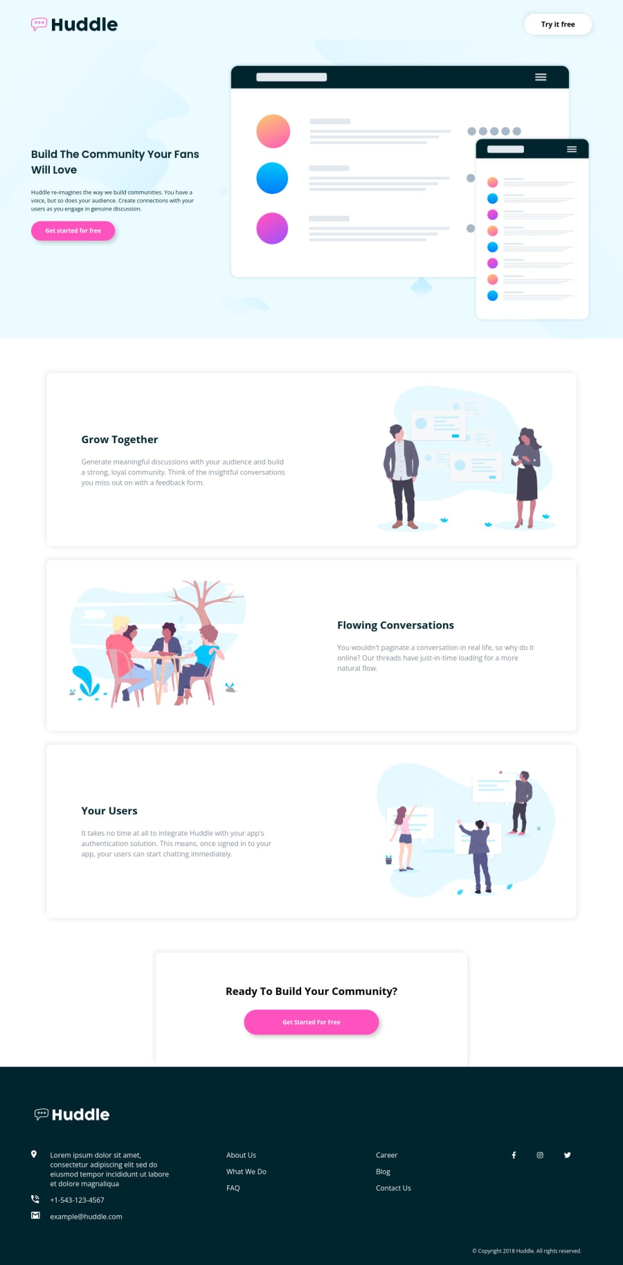
Huddle landing page with alternating feature blocks
@sarvothamgowda
Design comparison
SolutionDesign
Solution retrospective
Hi folks,
This was a fun yet challenging task. A few places where I went wrong:
- Not including the community section in the main or footer container.
Areas where I need help:
- Overlapping of community section.
I tried using transform: translateY(), but this section was instead getting hidden behind the footer. The z-index property was not helpful either.
- Adding a round border(circle) to the Social media icons:
Fixed the width and height of the icons. But, circles around the icons appeared as an ellipse. When padding was added, alignment was not proper, meaning the icons were not at the center.
- Also, the copyright section is flushed all the way to the bottom of the screen. Is it because of a lack of viewport height?
Open to other feedback!
Thanks for viewing my work.
Community feedback
Please log in to post a comment
Log in with GitHubJoin our Discord community
Join thousands of Frontend Mentor community members taking the challenges, sharing resources, helping each other, and chatting about all things front-end!
Join our Discord
