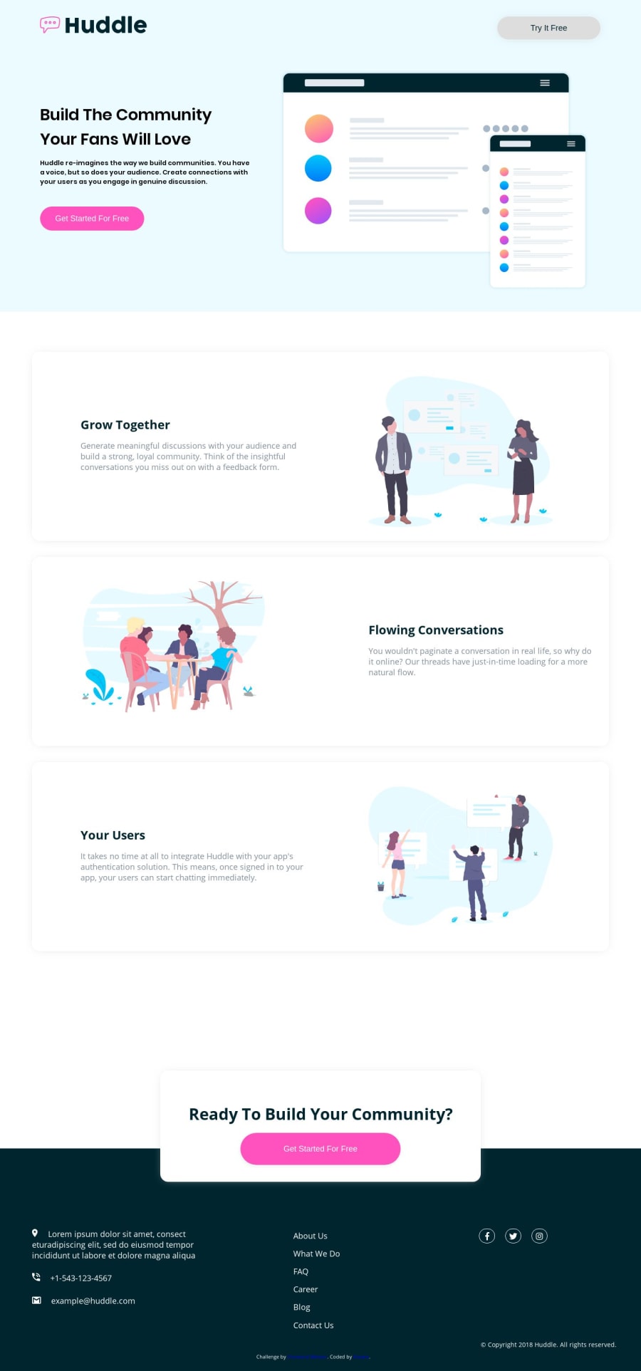
huddle landing page with alternating feature blocks
Design comparison
Community feedback
- @LorisDucampsPosted almost 5 years ago
Good morning Kotaro666,
attention: don’t forget to test your integration on other browsers. You will be surprised by the result:)
I think you also forgot the responsive mobile.
Good luck
1@Kotaro666-devPosted almost 5 years agoDear @LKA-LORIS,
Thanks for your feedback. I know it is not responsible for mobile device because I didn't know anything about a Responsive Web Design at that time.
However, I learned it and applied the technique to the most recent work. You can look at it if you want.
Here is the link: https://www.frontendmentor.io/solutions/huddle-landing-page-with-a-single-introductory-section-9PzQnuYYh
0@LorisDucampsPosted almost 5 years agoDear @Kotaro666,
When you test your integrations, check that there is no horizontal scroll bar (this disrupts navigation)
At the risk of repeating myself, check your integration on other browsers.
Otherwise good job
0
Please log in to post a comment
Log in with GitHubJoin our Discord community
Join thousands of Frontend Mentor community members taking the challenges, sharing resources, helping each other, and chatting about all things front-end!
Join our Discord
