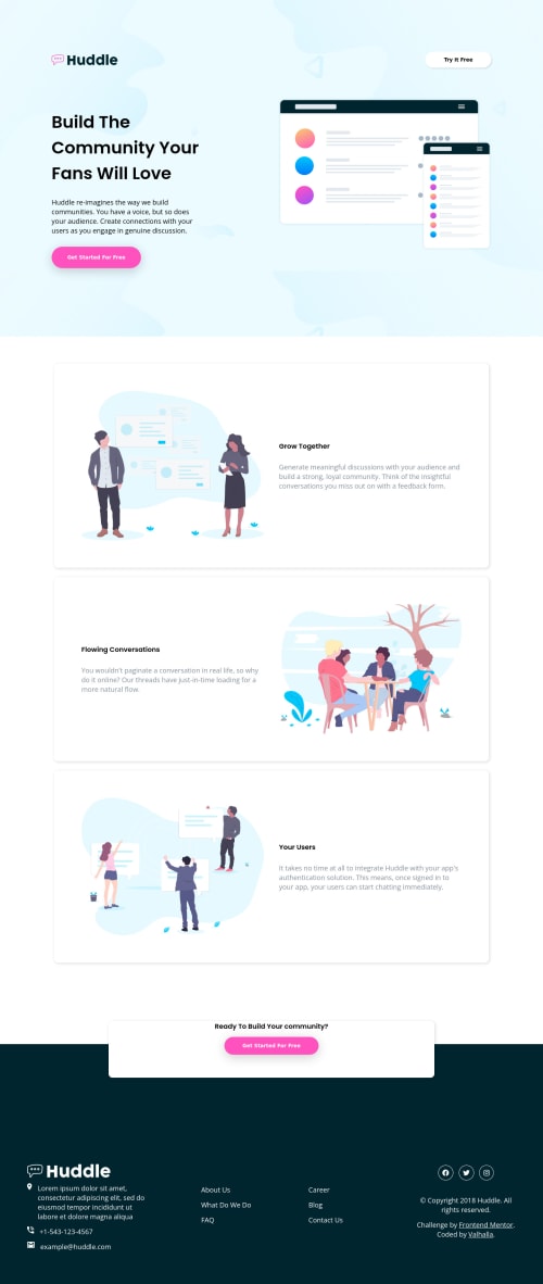
Design comparison
SolutionDesign
Solution retrospective
it was difficult for me to build the floating section , and make responsive .
- what is best way to build the design ?
- what would be the best practice to make element go on top of another using css position without damaging the design yet it should be responsive ?
- Is my design look ok ?
- Is my code too lengthy , is it readable ?
Community feedback
- @grace-snowPosted about 2 years ago
Hi
- I think you're misunderstanding html landmark elements here...
Header
is a landmark, like main and footer, so should go above themain
. Inside this, you'd usually have a logo and anav
. But in this design there is no nav in the header, just a logo and a call-to-action, so you do not need the nav element there at all - "Try it free" would most likely navigate to a new page so should be an anchor tag, not a button element
- A lot of the layout overlap in this is caused by large % paddings. Remember you can use things like gap in flexbox/grid and max-width to create a responsive layout. And you can use other flex properties like -grow -shrink and -basis, which I can see is used in a few places but with a lot of auto values and width still added.
- Similarly, buttons (even though they should be anchor tags) should not have % widths applied. Instead, use padding in em to make them look right. Otherwise you lose all control over how those elements will look because you are forcing them to be a specific % width of their parent (whose width you also do not know)
- Font size should never be in px. Convert to rem instead
- Alt text shouldn't say things like "image" or "photo" in them as they already have an image role. This text should be an actual description of how an image looks if it is meaningful content
- I think 600px is a little early to be switching to desktop layout. The layout appears really squished at 600px so consider making that change happen at a larger point when there is more space
- Headings must go in order. You cannot have a h1 right at the end of the page
- Icons like 'location' etc are decorative so should have empty alt like
alt=""
- There should be a nav in the footer with one unordered list, not two. You can use column properties on larger screens to split into multiple columns. Each of the items within it is clearly meant to be clickable navigation to other pages, so these all need to be anchor tags
- Similar with social media icons - wouldn't you expect them to be clickable? So they need to be anchor tags and labelled accessibly
Marked as helpful0@Valhalla-2Posted about 2 years ago@grace-snow It is very helpful, thank you very much ,,,
0 - I think you're misunderstanding html landmark elements here...
Please log in to post a comment
Log in with GitHubJoin our Discord community
Join thousands of Frontend Mentor community members taking the challenges, sharing resources, helping each other, and chatting about all things front-end!
Join our Discord