Submitted about 4 years ago
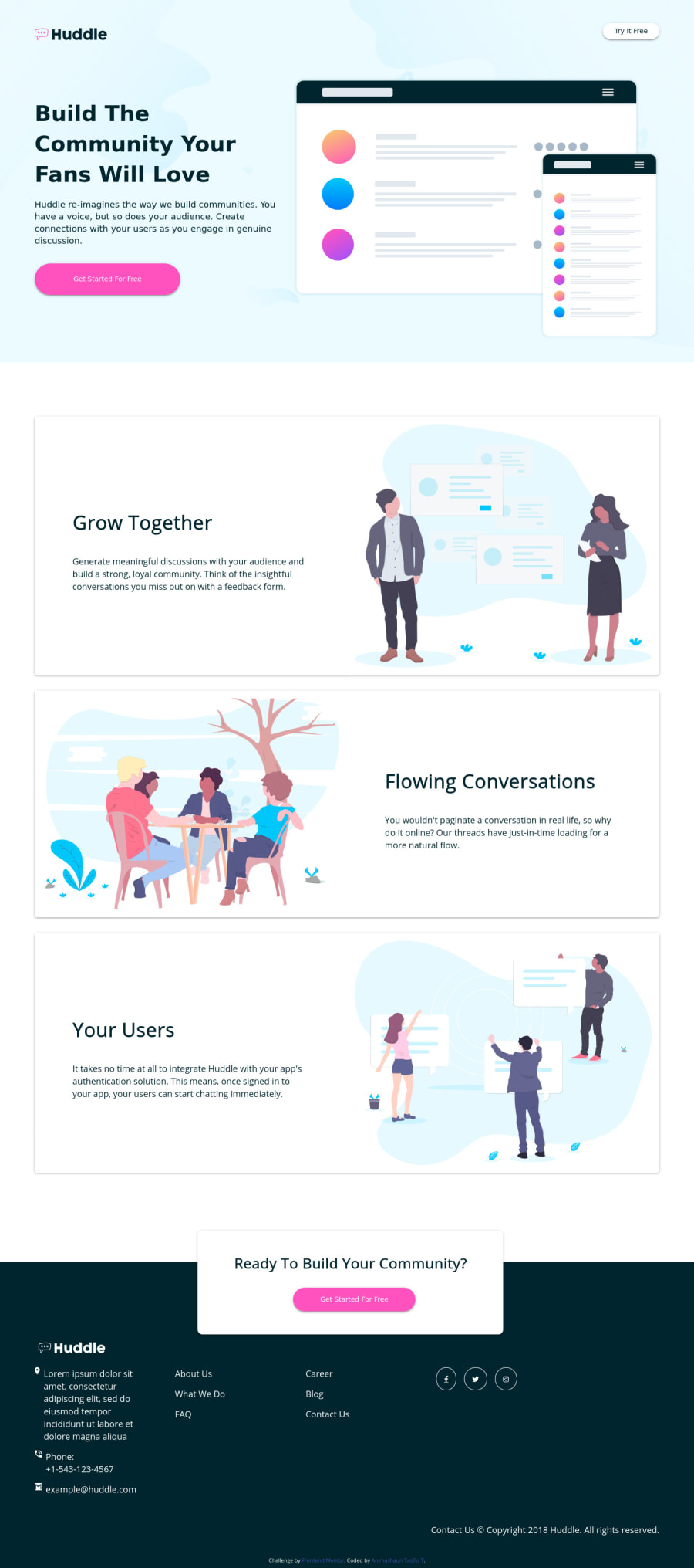
Huddle Landing Page with Alternating Blocks
@blade-01
Design comparison
SolutionDesign
Solution retrospective
A feedback would be nice
Community feedback
- @jomefavouritePosted about 4 years ago
Hello
I noticed you did a torn of projects today. My feedback for the project will be at this point
paddinghaving%isn't good mostly on a large screen.@media (min-width: 1440px) .showcase { width: 100%; /* padding-top: 7%; */ }Having a fixed
heightalso causing some issues@media (min-width: 1000px) .header { background: url(./images/bg-hero-desktop.svg) no-repeat center center/cover; padding-top: 3rem; width: 100%; /* height: 550px; */ }You could use mine as reference here
Note this was my very first challenge from frontendmentor so it's not that's good but it doesn't have the issues yours' have.
1@blade-01Posted about 4 years ago@jomefavourite Thanks for the feedback, I really appreciate it.
1
Please log in to post a comment
Log in with GitHubJoin our Discord community
Join thousands of Frontend Mentor community members taking the challenges, sharing resources, helping each other, and chatting about all things front-end!
Join our Discord
