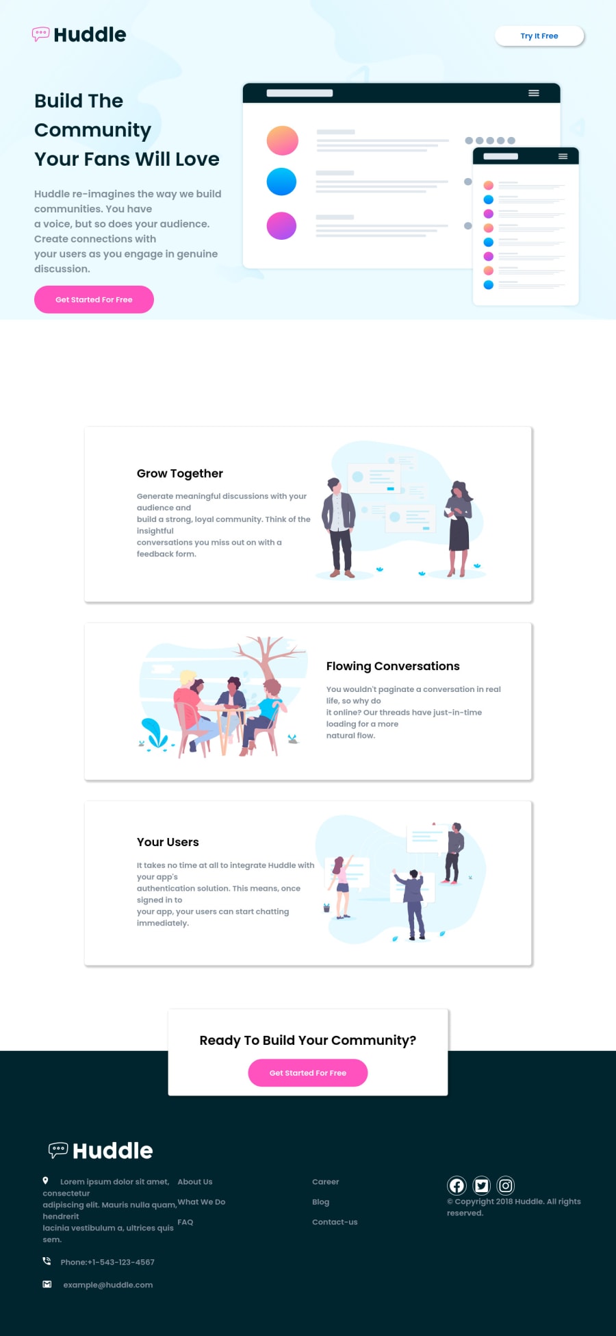
Huddle Landing page with alternating block using Flexbox and Grid
Design comparison
Solution retrospective
Working on this challenge was quite stressful, what did I find difficult while building the webpage? I found the width for mobile screen specially difficult, the size of the main width, also there's an overflow by the size of mobile screen. Your constructive criticism is highly required cause this is my first time working on a webpage. Thank you
Community feedback
- @sahand-masolehPosted about 2 years ago
Hi Busoalmi! You can trace overflow problems in the dev console quite easily, just look a what's sticking out. Just press
ctrl+shift+cand see what you find.In the desktop view, the cause of the overflow is that your mockup image doesn't shrink. In mobile view, you have set an absolute width on your
text-contentelement which causes the overflow.This challenge might be a bit much if this your first webpage, I suggest sorting the challenges by difficulty and starting from the top, all of them have some new thing to learn about.
Marked as helpful0
Please log in to post a comment
Log in with GitHubJoin our Discord community
Join thousands of Frontend Mentor community members taking the challenges, sharing resources, helping each other, and chatting about all things front-end!
Join our Discord
