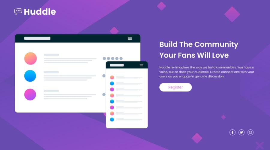
Huddle landing page with a single introductory section with HTML & CSS
Design comparison
Solution retrospective
Hi, it's my first challenge on Frontend Mentor, so I'll be very greatfull for your feedback!
I fixed issue with icons, thanks to Elaine (@elaineleung).
Now I wondering what is the best practice to switch between desktop design and mobile design. In this solution, I do it when the window width becomes less than 575px. And I'm wondering if there is a best practice for this or if it always depends on the design.
Thank you! Amir
Community feedback
- @elaineleungPosted about 2 years ago
Hi Amir, well done here, and about your question, here is what I did in my solution:
I used an
a
tag to wrap everything, which includes:- A visually hidden tag that is only for screen readers so that they can read out
Facebook
- A
span
tag that wraps around the Font Awesome icon
<a class="footer__social-group" href="https://www.facebook.com"> <span class="visually-hidden">Facebook</span> <span class="footer__social-icon facebook"> <i class="fab fa-facebook-f" data-icon="facebook" aria-hidden="true"></i> </span> </a>
For the CSS, this is what I used:
.footer__social-icon { display: grid; place-content: center; border-radius: 50%; width: 28px; height: 28px; border: 1px white solid; color: white; } .visually-hidden { clip: rect(0 0 0 0); -webkit-clip-path: inset(50%); clip-path: inset(50%); height: 1px; overflow: hidden; position: absolute; white-space: nowrap; width: 1px; } i.fab { height: 80%; } span.facebook { font-size: 12px; }
Hope this helps, and if you like you can check out my solution here: https://www.frontendmentor.io/solutions/landing-page-with-scss-bem-and-html-oFnvUpqYs8. I did it a while ago, and so there are things I'd definitely change and improve on, but it can still be used as a reference for now. Good luck!
Marked as helpful1@Amir837Posted about 2 years agoHi @elaineleung,
Thank you for your help!!! The css class .footer__social-icon is indeed what I needed!
Thank you!
1 - A visually hidden tag that is only for screen readers so that they can read out
Please log in to post a comment
Log in with GitHubJoin our Discord community
Join thousands of Frontend Mentor community members taking the challenges, sharing resources, helping each other, and chatting about all things front-end!
Join our Discord