Submitted about 2 years ago
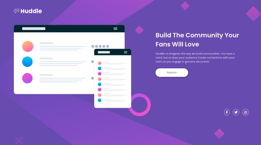
Huddle Landing Page Section(Flexbox+Responsive)
#animation

@vitorantonionne

Design comparison
SolutionDesign

Solution retrospective
Hello, I'm Vitor this is my solution to this challenge.
Feedback is always welcome, I had some difficulties adjusting to the screen(MOBILE), so if you have any tips, send them to me
Olá, sou Vitor esta é a minha solução para este desafio.
Tive umas dificuldades na parte de ajustar para mobile , então não ficou 100% , mais ficou bem ajustado , quem tiver dicas pode mandar .
Qualquer feedback sobre como posso melhorar e reduzir o código desnecessário é bem-vindo!
Community feedback
Please log in to post a comment
Log in with GitHub
Join our Discord community
Join thousands of Frontend Mentor community members taking the challenges, sharing resources, helping each other, and chatting about all things front-end!
Join our Discord