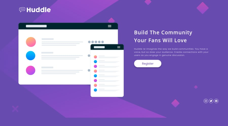
Huddle landing page with a single introductory section


Design comparison

Solution retrospective
EN: In this challenge, I decided to do it differently from the previous ones, starting with mobile and I confess that it was much easier to work with the responsiveness adjustments. I will definitely adopt this for future projects!
This is my solution for the Huddle landing page with a single introductory section challenge. Feel free to leave any feedback about the solution or the code! Thank you very much in advance!
PT: Neste desafio, eu resolver fazer diferente dos anteriores começando pelo mobile e confesso que ficou bem mais fácil para trabalhar com os ajustes de responsividade. Com certeza adotarei isso para os próximos projetos!
Esta é a minha solução para o desafio Huddle landing page with a single introductory section. Sinta-se à vontade para deixar qualquer feedback sobre a solução ou sobre o código! Desde já, muito obrigado!
Community feedback
Please log in to post a comment
Log in with GitHub
Join our Discord community
Join thousands of Frontend Mentor community members taking the challenges, sharing resources, helping each other, and chatting about all things front-end!
Join our Discord