Submitted almost 2 years ago
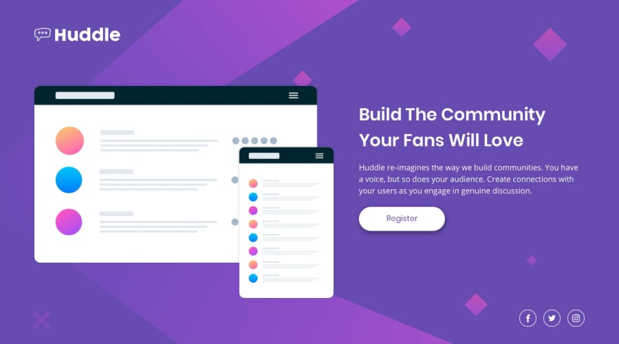
Huddle landing page with a single introductory section
@fatimamammadova
Design comparison
SolutionDesign
Solution retrospective
All feedback is welcome thank you in advance ))
Community feedback
- @VCaramesPosted almost 2 years ago
Hey there! 👋 Here is some feedback to further improve your code:
- The logo’s
alt tagdescription needs to be improved upon ⚠️; it should ALWAYS state the company’s name.
- You do not need to wrap everything in
divsLINK:
UPDATED
<div class="about"> <h1>Build The Community Your Fans Will Love</h1> <p>Huddle re-imagines the way we build communities. You have a voice, but so does your audience. Create connections with your users as you engage in genuine discussion.</p> <button>Register</button> </div>- Your "buttons" were created with the incorrect element ❌. When the user clicks on the button they should be directed to a different part of you site. The
anchor tagwill achieve this.
- The social media icons are meant to be interactive ⚠️. So each individual icon needs to be wrapped in a
anchorelement and have anaria-labelfor accessibility.
More Info:📚
- Implement a "Mobile First" approach 📱 > 🖥
Mobile devices are now the dominant 👑 way in which people browse the web, it is critical that your website/content looks perfect 💯 on all mobile devices.
More Info: 📚
- For improved accessibility 📈 for your content, it is best practice ✅ to use
remfor yourfont-sizeand other property values. Whileemis best formedia-queries. Using these units gives users the ability to scale elements up and down, relative to a set value.
If you have any questions or need further clarification, you can always check out my submission and/or feel free to reach out to me.
Happy Coding! 👾
Marked as helpful0 - The logo’s
Please log in to post a comment
Log in with GitHubJoin our Discord community
Join thousands of Frontend Mentor community members taking the challenges, sharing resources, helping each other, and chatting about all things front-end!
Join our Discord
