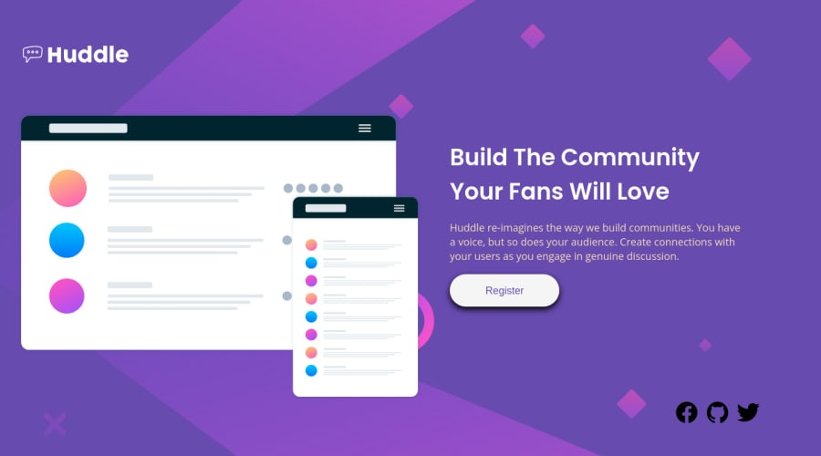
Huddle landing page with a single introductory section challenge hub
Design comparison
Solution retrospective
Finally i complete my challenge and i Update my project using SASS/SCSS Wrap all the CSS Code into SCSS Code 😎😊, and then upgrade my Projects. Best Way to learn new technologies update your projects and used new technologies in your projects and time to time update the projects. Then Your skills improved 😊😊 in this process
#html #SCSS #SASS #frontenddeveloper.
Community feedback
- @grace-snowPosted over 2 years ago
Hi
This css is not good any more - you've nested selectors very deeply, which is extremely problematic once it's a real project. When using scss your resulting css should look exactly how you would have written it from scratch. You would not write css like this. Remove all the nesting and use single class selectors just like you would if you were writing nice clean low specificity css
Additionally, your code is.longer and less performant because you're using max width media queries. Work mobile first and use min width media queries instead
Good luck
Marked as helpful1@grace-snowPosted over 2 years agoOther minor things
- no need for spans around social links
- social links only need to say the name of the platform like Facebook, not Facebook-logo
- no need to ever limit the width of body. Think of body element as your sheet of paper, you never limit that, only elements within it
1@GitHub-dev12345Posted over 2 years ago@grace-Thanks for review my code and suggest me, i apply your all minor things in my code, Change the code and make code readable and systematically and understable 😎👍
0 - @vanzasetiaPosted over 2 years ago
Hi there! 👋
Congratulations on improving this solution! 🎉
You have received incredible feedback from @grace-snow. I would recommend applying all the feedback that she has given to you before doing another challenge.
Some feedback from me:
- Accessibility
- Usually, the logo is wrapped by an anchor tag that will navigate the user to the home page (
href="/"
). - Don't use
br
elements for presentational purposes. Read what MDN documentation says about it. - For any decorative images, each
img
tag should have emptyalt=""
andaria-hidden="true"
attributes to make all web assistive technologies such as screen reader ignore those images. In this case, the illustration is decorative only. - Create a custom
:focus-visible
styling to any interactive elements (button
, links,input
,textarea
). This will make the users can navigate this website using keyboard (by usingTab
key) easily.
- Usually, the logo is wrapped by an anchor tag that will navigate the user to the home page (
- Styling
- What is the purpose of doing this? I would recommend removing it if you have no reason.
body footer { /* In footer tag attribution scss code */ }
- On
1280px
width, the layout is still in a mobile layout and the illustration looks so big. - The register button has a very dark box shadow.
- Each social media icon should be white and have a white circle border.
- Best Practice (Recommended)
- I would also recommend writing the styling using the mobile-first approach. It often leads to shorter and better performance code. As a result, mobile users will no longer be required to process all of the desktop styles.
- Don't nest selectors too much! The stylesheet has a high level of specificity at the moment, which will make it difficult to maintain, especially on larger projects.
That's it! I hope this information is useful! 😁
1@GitHub-dev12345Posted over 2 years ago@vanzasetia I apply your suggestion in my code and my code very improve thank you so much support me and review my code 👍
0 - Accessibility
Please log in to post a comment
Log in with GitHubJoin our Discord community
Join thousands of Frontend Mentor community members taking the challenges, sharing resources, helping each other, and chatting about all things front-end!
Join our Discord