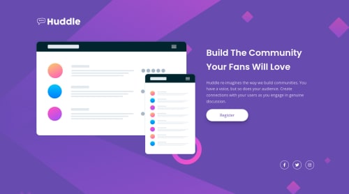
Submitted almost 4 years agoA solution to the Huddle landing page with a single introductory section challenge
Huddle landing page with a single introductory section challenge
@TejaswiniLabade

Solution retrospective
Hi community members, one more amazing challenge I just completed. I would really appreciate your awesome feedback.
Code
Loading...
Please log in to post a comment
Log in with GitHubCommunity feedback
No feedback yet. Be the first to give feedback on Tejaswini Labade's solution.
Join our Discord community
Join thousands of Frontend Mentor community members taking the challenges, sharing resources, helping each other, and chatting about all things front-end!
Join our Discord