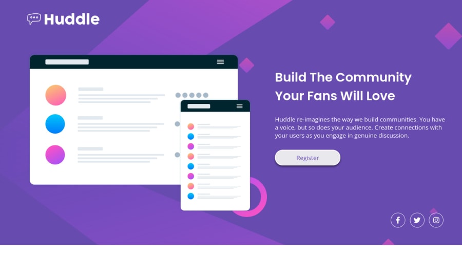
Design comparison
Solution retrospective
This is my first try at a coding challenge. I have been learning HTML and CSS on and off in 2022 and wanted to put what I have learned to the test. Unfortunately I didn't practice much for the past few months, so this challenged served as a bit of a refresher.
The most difficult part for me was getting the website to be (semi-)responsive. Because the challenge includes designs for desktop and mobile versions, my aim was to get those versions as close to the design as possible. As a result however, the inbetween state is less then ideal.
The way I tried to incorporate responsivity was by using media queries. Although this works fairly well, I felt that the code got confusing quickly as I did more and more through media queries. I feel like there should be a more elegant solution, but this was the best I could come up with considering my limited experience.
For now, I am very interested to learn more about CSS grid. I feel that if I could employ that better, I might be able to scale down the use of media queries. Besides that, the freedom and control grid offers for creating layouts is very appealing to me. I do wonder though, if it would be better to focus on writing better HTML first. Any tips would be highly appreciated!
Community feedback
Please log in to post a comment
Log in with GitHubJoin our Discord community
Join thousands of Frontend Mentor community members taking the challenges, sharing resources, helping each other, and chatting about all things front-end!
Join our Discord
