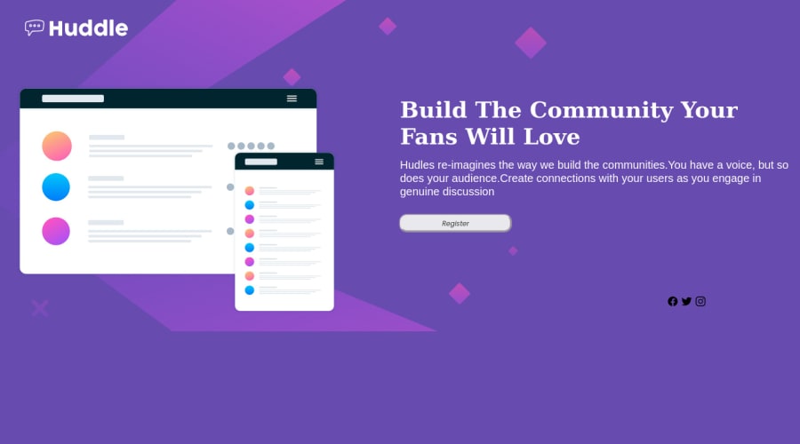
Design comparison
Solution retrospective
Positioning the element really gave me though time
Community feedback
- @MelvinAguilarPosted almost 2 years ago
Hello there 👋. Good job on completing the challenge !
I have some suggestions about your code that might interest you.
- You should use semantic tags instead of generic tags like
divorspan. Semantic tags help to improve the semantics of your code and make it easier to understand.
<body> <header></header> <main></main> </body>- A logo may not be considered as a decoration in HTML because it is often a crucial part of a website's branding and identity, and it may contain important information for the user. you should use the company name as the
altattribute value. The word "logo" is not necessary.
-
Social media icons, which are often used to link to a company's social media profiles, should typically be anchor elements because anchor elements allows users to easily click on the icon and be taken directly to the company's social media profile page. This makes it easy for users to connect with the company on social media
Additionally, you should use the
altattribute to describe the links if they don't have visible text, this will help screen reader users to understand the purpose of the link.
- You should use the
cursor: pointerproperty to indicate that the element like a button or a link is clickable.
I hope you find it useful! 😄
Happy coding!
1 - You should use semantic tags instead of generic tags like
Please log in to post a comment
Log in with GitHubJoin our Discord community
Join thousands of Frontend Mentor community members taking the challenges, sharing resources, helping each other, and chatting about all things front-end!
Join our Discord
