Submitted 11 months ago
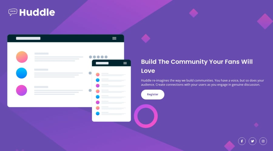
Huddle landing page with a single introductory section
#sass/scss
@bttrvng99
Design comparison
SolutionDesign
Solution retrospective
What are you most proud of, and what would you do differently next time?
How to use all , and tags as well as write a landing page that fits the entire screen
What challenges did you encounter, and how did you overcome them?How to make the main hero section stretch to fill the page, by setting box-sizing: border-box to all elements, then set "display: flex, flex-direction: column, height: 100vh" to the tag
What specific areas of your project would you like help with?Any kind of help is appreciated, especially with the main image when zoomed out.
Community feedback
Please log in to post a comment
Log in with GitHubJoin our Discord community
Join thousands of Frontend Mentor community members taking the challenges, sharing resources, helping each other, and chatting about all things front-end!
Join our Discord
