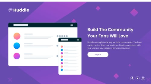
Submitted about 1 year agoA solution to the Huddle landing page with a single introductory section challenge
Huddle landing page with a single introductory section
@percydocomo

Solution retrospective
What are you most proud of, and what would you do differently next time?
Finishing the project. With more practice, I am more comfortable with layout using flexbox and grid.
What challenges did you encounter, and how did you overcome them?The active state. I changed the background color of the button and the icons on hover and used the transition property to smooth out the hover effect.
Code
Loading...
Please log in to post a comment
Log in with GitHubCommunity feedback
No feedback yet. Be the first to give feedback on percydocomo's solution.
Join our Discord community
Join thousands of Frontend Mentor community members taking the challenges, sharing resources, helping each other, and chatting about all things front-end!
Join our Discord