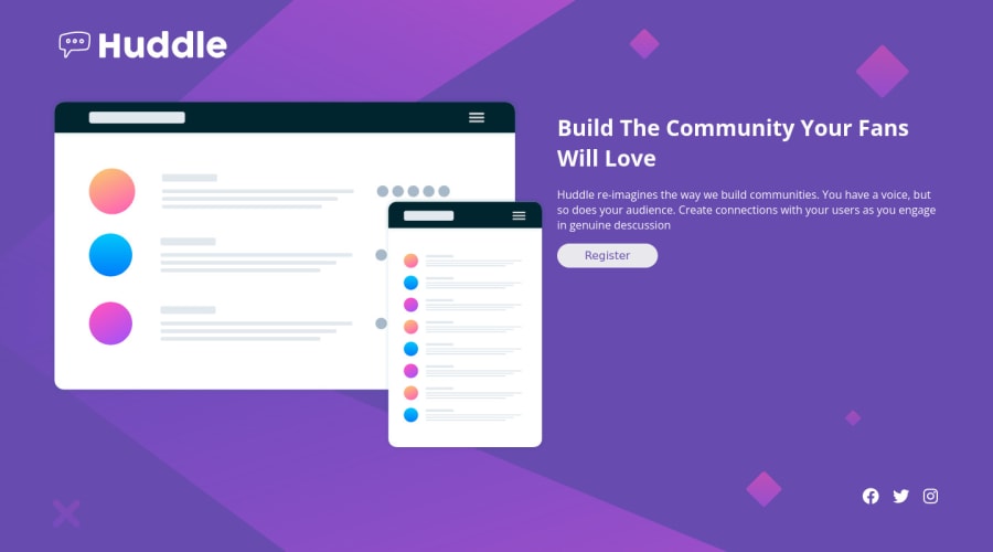
Huddle landing page with a single introductory section
Design comparison
Solution retrospective
Q1 I have use css grid is It correct or should I have gone with flex box? Q2 please check my media query and is there any better way to optimize them.
Community feedback
- @FluffyKasPosted over 2 years ago
Hiyo,
Both grid and flexbox can be used for this challenge so whatever suits you. On the other hand, if you're not sure what you're doing with grid, it can get real messy. Flexbox might be a bit easier to understand for newbies. From what I can see in your code, you might want to check out some grid learning resources (I can recommend some if you don't know any).
But to provide some quick fix:
-
Remove
grid-auto-rows
andauto-columns
, they do nothing for you here. -
Change your
height
tomin-height: 100vh
(you don't want to lock your website to a fixed height). This will reveal some additional problems: having some extra rows in your solution. Just get rid of thegrid-template-rows
altogether and it will be fine, you don't really need to define them here. -
Change the
width
on your body tomax-width
. Don't use % or vw for this, as it will stretch and stretch your solution as the screen size gets larger. Use rems instead. Or a combination of width and max-width can also work, like this:width: 90%
,max-width: 100rem
(this is just a guess, may not be the best width in this case, but you get the idea).
To answer your second question, your media query seems perfectly fine. If you wanna optimise it, try a mobile-first workflow and use min-width in your next project. That way you usually can get away with writing less code and it's considered best practice.
There are some other things to be aware of:
-
Don't set width: 50vw on images. It's the best to use the following code most of the time:
max-width: 100%
,height: auto
,display: block
. This ensures that your image scales properly, no matter the screen size. -
Adding a
background-size: cover
to thebody
would make sure the bg image covers the whole screen nicely. -
You could wrap your social media images in
a
tags (as they're links) and then add aria-labels andcursor: pointer
to them. -
Add a
cursor: pointer
to your button as well. -
Wrap your main content in
main
(so everything apart from the header and footer).
There's a few other small bits, but all in all, just look up grid/flexbox a bit. ^^ I found, this isn't actually a very easy challenge to do layout wise so you did well! Good luck!
Marked as helpful3@sahil899Posted over 2 years agoHi @FluffyKas I would love to have some recommendation of learning resource on css grid. I will keep in mind your advice about not using fixed width and height in further challenges. Thanks for the feedback, looking forward to more feedback on further challenges.
0@FluffyKasPosted over 2 years ago@sahil899 Some stuff I'd use:
-
If you don't know Kevin Powell, check out his channel, it's a great source of anything css-related. He has a playlist of css grid videos, even the older ones are super useful.
-
freecodecamp is an obvious choice. It didn't help me personally, but probably many others would recommend it.
-
There's even a game called Grid Garden. I used this when I was starting out. There's a flexbox version, too.
-
CSS Tricks has a complete guide on grid. Perhaps not suitable for learning grid from 0, but to this day I use it as a reference when things don't work out.
-
Might be obvious but Frontend Mentor heaps of resources too, probably including the ones I mentioned above. There's courses, tools, articles, everything. I totally ignored that for months for some reason, don't make the same mistake >.<
As a final piece of advice, once you feel like you've learned some, just play around in Codepen or some other code editor, that's the best way to get better at it without feeling like you have to commit to a full project.
Marked as helpful1 -
Please log in to post a comment
Log in with GitHubJoin our Discord community
Join thousands of Frontend Mentor community members taking the challenges, sharing resources, helping each other, and chatting about all things front-end!
Join our Discord