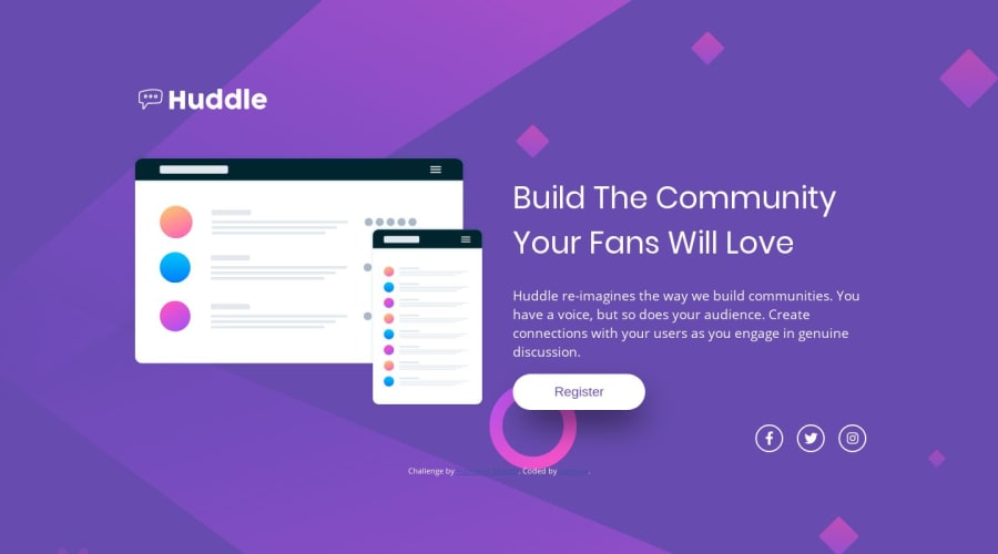
Design comparison
Solution retrospective
I had a hard time trying to copy the background in the desktop version of this design. I don't know what size to use so the whole svg image is fit within the screen.
Community feedback
- @LorisDucampsPosted over 4 years ago
Dear CAMSMY,
You did very well to use the body tag to apply your background image.
Do not forget to check your integration on mobile and to check that your elements do not exceed the container :)
Good luck :)
1@camsmyPosted over 4 years ago@LKA-LORIS yes I always consider my mobile and tablet view in building my projects. Thank you for the feedback! I truly appreciate it.
0 - @mattstuddertPosted over 4 years ago
Nice work on this challenge! One thing I'd recommend reviewing is the report to try and clear the errors. You've done a really good job though. Keep it up!
0
Please log in to post a comment
Log in with GitHubJoin our Discord community
Join thousands of Frontend Mentor community members taking the challenges, sharing resources, helping each other, and chatting about all things front-end!
Join our Discord