Design comparison
Community feedback
- @MelvinAguilarPosted almost 2 years ago
Hello there 👋. Good job on completing the challenge !
I have some suggestions about your code that might interest you.
HTML 📄:
- The
<br>tag is not a semantic element. If a screen reader user is reading the page, they will hear "line break", which breaks the flow of the content. Instead, use CSS properties likemargin,paddingormax-widthto add vertical space between elements.
-
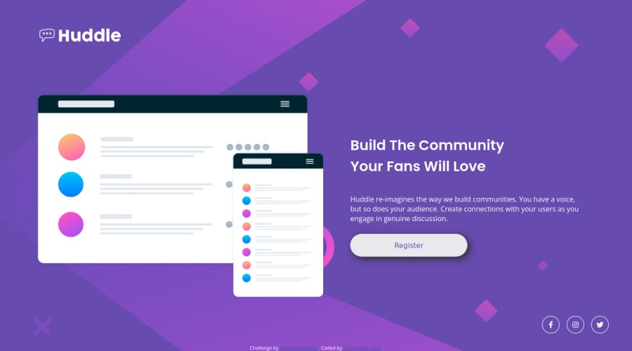
Why are social media icons buttons?. What is the expected effect after clicking the button, should it redirect the user to the company's social media or perform an action such as calculations, sending a form, etc.?
Social media icons, which are often used to link to a company's social media profiles, should typically be anchor elements (<a>) and not buttons because anchor elements allows users to easily click on the icon and be taken directly to the company's social media profile page. This makes it easy for users to connect with the company on social media
-
You should use the
aria-labelattribute to describe the links if they don't have visible text, this will help screen reader users to understand the purpose of the link.e.g.
<a href="#" aria-label="Facebook"><i class="fab fa-facebook-f" aria-hidden="true"></i></a>
I hope you find it useful! 😄 Above all, the solution you submitted is great!
Happy coding!
Marked as helpful0@wfarrePosted almost 2 years ago@MelvinAguilar Thank you for your feedback. Especially for <br> tag, it's interesting, because I was thinking to work more on the accessibility after.
Regarding the button tag for the links, I have no answer, except I published too fast maybe lol.
1 - The
Please log in to post a comment
Log in with GitHubJoin our Discord community
Join thousands of Frontend Mentor community members taking the challenges, sharing resources, helping each other, and chatting about all things front-end!
Join our Discord
