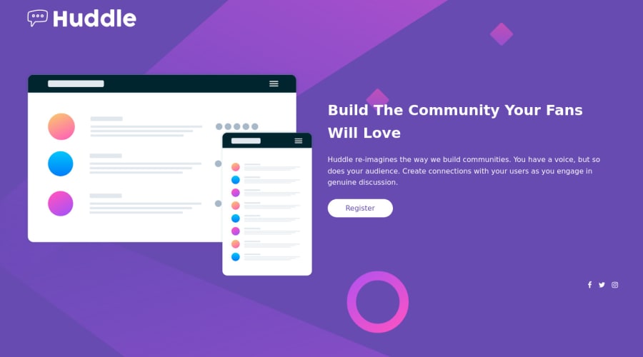
Design comparison
Solution retrospective
So I'd like to know : How can I make the background image look better ? or how can I position it better ?
Thanks in advance.
Community feedback
- @HassiaiPosted almost 2 years ago
Wrap the content of the html in a main tag with the exception of the footer tag to fix the accessibility issues. click here for more on web-accessibility and semantic html
Add aria-label attribute
aria-label=" "to the <a> of the social media icons to fix the error and accessibility issue. The value of the aria-label is the description of the image. For more aria-label click herefor the left and right sides of the page, give .logo, .hero and the footer a max-width of 1440px, a width of 80% and margin:0 auto.
.hero, .logo, footer{
max-width:1440px;
width: 80%;
margin:0 auto;
}
Hope am helpful.
Well done for completing this challenge. HAPPY CODING
Marked as helpful0 - @Lino-OTMPosted almost 2 years ago
Hi @Makha! Excellent job with this one!
You might want to use for the background-size properties such as contain and cover, it will help you to reach a pixel-perfect style, and remember to use them depending on the screen device so you might want to change them using media-queries. You also can use the property background-position with any of these values top, right, bottom, left, and more than one at the time.
Marked as helpful0
Please log in to post a comment
Log in with GitHubJoin our Discord community
Join thousands of Frontend Mentor community members taking the challenges, sharing resources, helping each other, and chatting about all things front-end!
Join our Discord
