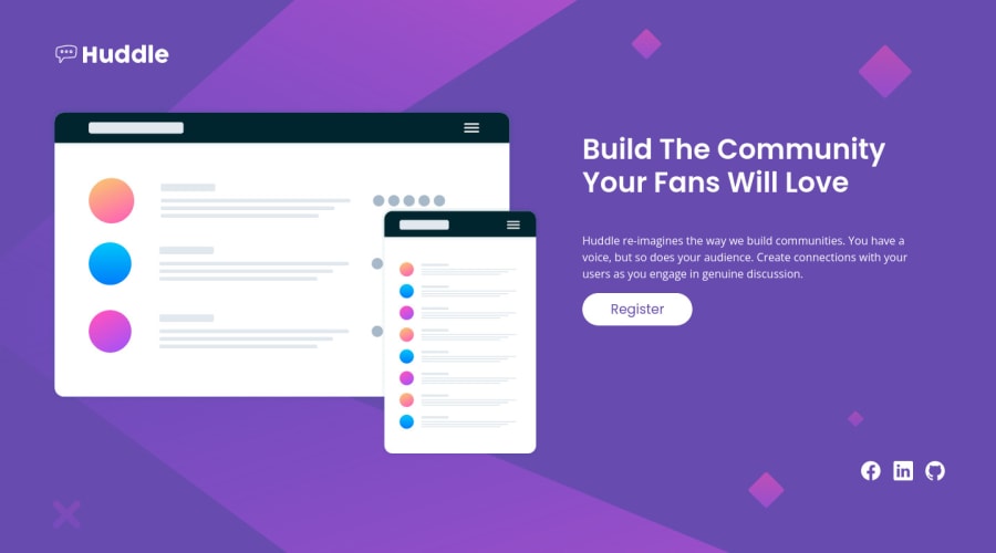
Huddle-landing-page-with-single-introductory-section


Design comparison

Solution retrospective
Hello, thank you for coming and looking at my code!
This is my solution for this challenge, I hope it's up to the standards, but if it's not, please feel free to tell me! Thank you in advance.
Community feedback
- @eewa-SANJPosted almost 2 years ago
Hello!. Your solution looks fantastic and I have gone through your code. There are a few issues found in your codes. Here are my findings.
- Your main large image and other text and button overlap each other. Try to fix it.
- In smaller screen sizes, h1, p, and buttons are not verticle centered. you can align it by adding align-item: center into the flex div container. (class = "row" in your file)
- Social icons are not styled properly. You have to add a border and some padding to isolate inside a circle.
- In "Register" you don't add the box shadow. Do see that?
- Learn to use rem instead of using px. It is a suggestion and best practice.
I think, my findings will help you to improve your coding.
Happy coding😊
Marked as helpful2@malek-btPosted almost 2 years agoThank you @eewa-SANJ .. i will make it in mind .
1 - @hatemhenchirPosted almost 2 years ago
Hey Malek Bentaher, how are you ? I really liked the result of your project, but I have some tips that I think you will enjoy:
- Logo Huddle should be in tag,
<header>not in<main>like this:<body><header>your logo</header><main>your main page</main><footer>your footer(icons)</footer></body>for semantic page. - replace
<div class="id">with<section class="id">for semantic page. You can read more about semantic HTML here: HTML Semantic Elements - Implement a Mobile First approach 📱 > 🖥
If you have any questions or need further clarification, feel free to reach out to me.
Happy Coding! 🍂🦃
Marked as helpful1@malek-btPosted almost 2 years agoThank you @hatemhenchir I will make it in mind.
0 - Logo Huddle should be in tag,


Please log in to post a comment
Log in with GitHubJoin our Discord community
Join thousands of Frontend Mentor community members taking the challenges, sharing resources, helping each other, and chatting about all things front-end!
Join our Discord