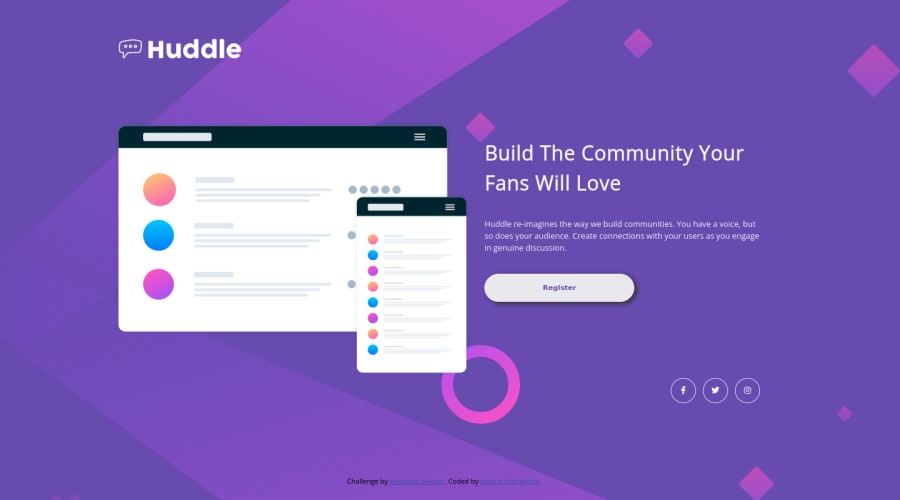
Huddle landing page with a single introductory
Design comparison
Solution retrospective
Here my solution for huddle landing page with a single introductory section, please give some feedback, thank you
Community feedback
- @kenreibmanPosted about 3 years ago
Good work! Just a few suggestions.
- I'm not sure why you put a
transform: scale(0.8);on yourcontainer, it's not necessary. - I would also put a
max-widthon yourcontainerdiv as well, since screen resolutions beyond1440pxgets your content too stretched, then I would center thecontainerdiv. - The font for your button is not correct as well, and I would give that a little more padding to the button to make it "bigger" and match the original design more.
I hope this helped, keep it up! You're doing a good job!
Marked as helpful0@audinastggPosted about 3 years ago@kenreibman thank you for your suggestion, I will try it on my code
0 - I'm not sure why you put a
- @Deevyn9Posted about 3 years ago
Went through the project, and it is absolutely stunning, great work.
Happy coding
0
Please log in to post a comment
Log in with GitHubJoin our Discord community
Join thousands of Frontend Mentor community members taking the challenges, sharing resources, helping each other, and chatting about all things front-end!
Join our Discord
