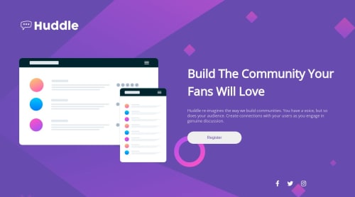
Submitted over 2 years agoA solution to the Huddle landing page with a single introductory section challenge
huddle landing page with a single introductory
accessibility
@Dribbz

Solution retrospective
Hello this is my solution to the landing page challenge ✌️ i had some trouble with the following :
-
the website stretches beyond 1440px which leads to distortion in layout
-
the icons needs to have a circular border with hover effects ( when the border is added they become oval and when i add
border-radius:50%;aspect-ratio:1;it still doesnt solve the oval shape around the icons -
the grid content area in desktop mode isnt fitted well as the design
-
had trouble adjusting the content area in desktop mode ( width and height )
Code
Loading...
Please log in to post a comment
Log in with GitHubCommunity feedback
No feedback yet. Be the first to give feedback on Abdelrahman's solution.
Join our Discord community
Join thousands of Frontend Mentor community members taking the challenges, sharing resources, helping each other, and chatting about all things front-end!
Join our Discord