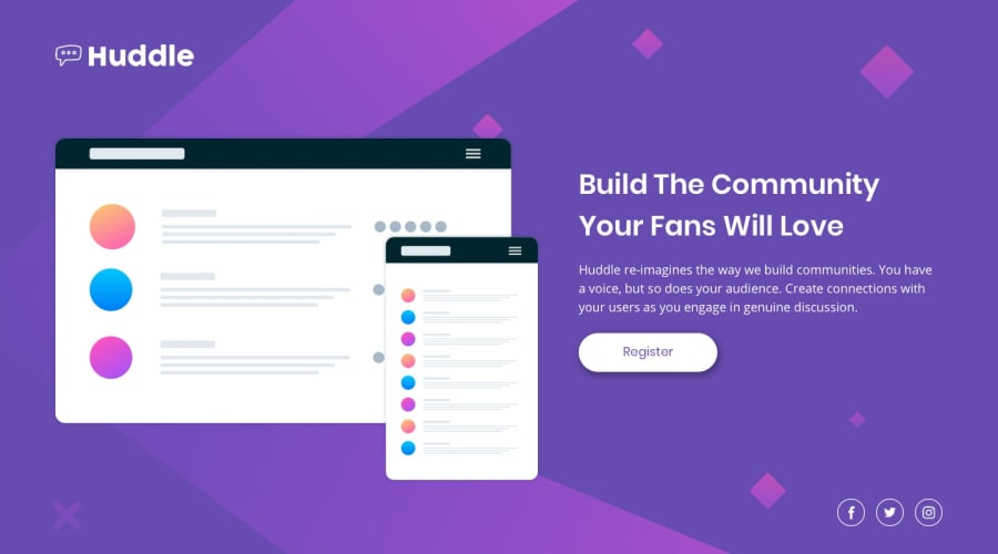
Design comparison
SolutionDesign
Solution retrospective
Would appreciate any kind of feedback 😊
Community feedback
- @roshankcpkrPosted over 2 years ago
Here are some things I would Iike to point out:
- Changing icons color to #fff
- Increasing button size with an additional 0.2em or suitable padding
Rest is nice. Good luck!
Marked as helpful0 - @hambergjessePosted over 2 years ago
Not much to criticize except that you did use an incorrect font and the placement and color of the social media icons is not right.
Everything else looks fantastic to me, I prefer your layout size etc over the original.
Marked as helpful0@xeuxdevPosted over 2 years ago@hambergjesse thanks for the nice words, when I did the challenge I didn't know how to change SVG icons images but I will update it 😊😊😊 Thanks so much😊
0
Please log in to post a comment
Log in with GitHubJoin our Discord community
Join thousands of Frontend Mentor community members taking the challenges, sharing resources, helping each other, and chatting about all things front-end!
Join our Discord
