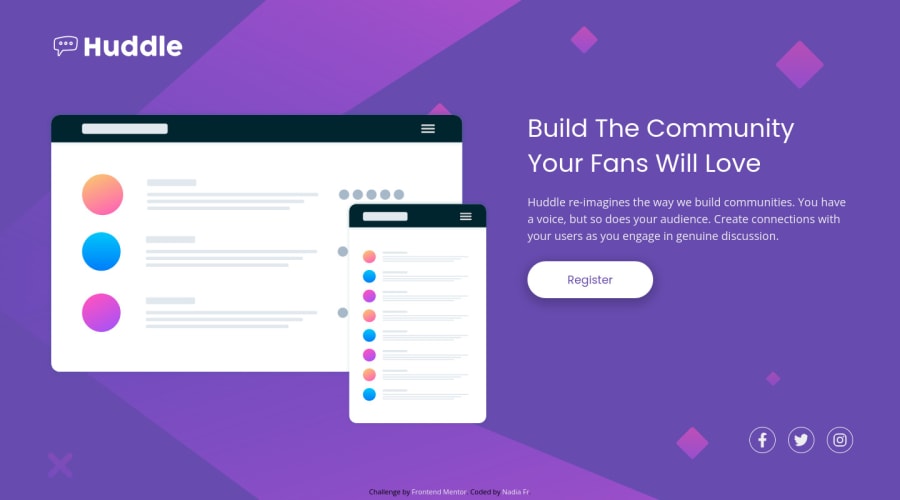
Huddle landing page (version desktop 1440px and mobile 375px)
Design comparison
Solution retrospective
Still have a problem with applying a pattern to the page. This time I added a <div> with one <img> , as a first <body> child ans possitioned it absolutely to the body.
Also, looks like fontawesome changed the applying method. As far as I remember later we had to add the specific link to the <head> and add the icon Ex: <i class="far fa-nom-icone"></i> in a code. Now it doesn't work
Community feedback
- @shashreesamuelPosted over 2 years ago
Hey good job completing this challenge
Keep up the good work
Your solution looks great however I think that the font weight of the title is supposed to be a bit heavier.
Secondly the content needs some margin from the top using
margin-top.I hope this helps
Cheers Happy coding 👍
Marked as helpful0 - @TroolKongPosted over 2 years ago
Hi I'm new here and I find your work awesome. For me I am learning at Udemy to become a FS Web Developer. I have finished with HTML and CSS but need more pratices before I jump to Bootstrap and JS... So I do not know if you can perform more than that...
0@NadiaFrShLmPosted over 2 years ago@TroolKong Hi, thanks for your message, I finished several courses of JS, FS dev, CSS, HTML and after all, I still don't have enough either courage or knowlrdge to srtart the chalenges with JS.
All that I advice you, to practice a lot. This platform is just perfect for polish your knowledge. Be patient and persistent.
0
Please log in to post a comment
Log in with GitHubJoin our Discord community
Join thousands of Frontend Mentor community members taking the challenges, sharing resources, helping each other, and chatting about all things front-end!
Join our Discord
