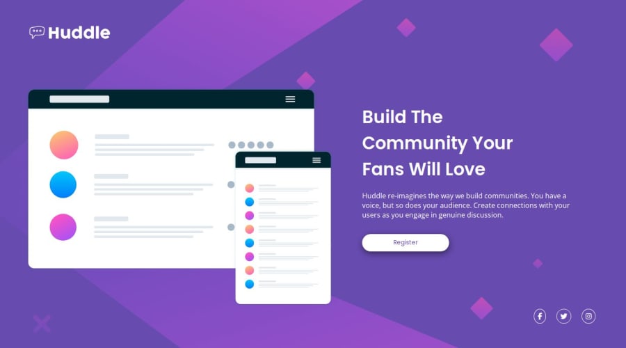
Design comparison
SolutionDesign
Solution retrospective
What are you most proud of, and what would you do differently next time?
The overall Alignment of the website. I managed to layout all the different sections into somewhat sensible and logical positions
What challenges did you encounter, and how did you overcome them?- Defining widths for certain divs and element were a pain in the ykw. I eventually gave up and used pixels to define which is not responsive. 2.My footers were not visible, but I managed to make it visible after closely examining the html code
- For the mobile version, I was unable to rotate the bg image as required. Pls suggest a way to rotate bg images.
2.How to put the right widths to the paragraph and button
3.How to scale down the image in the mobile version with using vw units.
Community feedback
Please log in to post a comment
Log in with GitHubJoin our Discord community
Join thousands of Frontend Mentor community members taking the challenges, sharing resources, helping each other, and chatting about all things front-end!
Join our Discord
