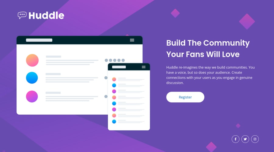
Design comparison
Solution retrospective
I seem to struggle with the layout of the webpage - especially with the desktop versions.
Is it correct to add the background images to the body and then have a main container that wraps everything? Then within that main container, have other smaller containers for the various elements.
Thanks for the help!
Community feedback
- @correlucasPosted over 2 years ago
👾 Hello Wesley, congratulations for your solution!
Nice that you've used mobile first approach for this solution!
Everything works good, there's only a quick for the mobile background image that's not filling all the background. Swapping from
background-size: contain;tocover. See the code below:background-image: url(./images/bg-mobile.svg); background-repeat: no-repeat; background-position: top; background-size: cover; background-color: var(--violet); }Hope it helps, congrats!
Marked as helpful0@wesleyjacobyPosted over 2 years ago@correlucas Thanks man! I do mobile first because I find it easier than desktop. facepalm Haha
Thanks for the tip - I'll update the code! :) Glad to know I'm on the right track, even though it doesn't feel like it.
1@correlucasPosted over 2 years ago@wesleyjacoby You did good, I never did a solution with mobile first, I should try that. Congrats.
1
Please log in to post a comment
Log in with GitHubJoin our Discord community
Join thousands of Frontend Mentor community members taking the challenges, sharing resources, helping each other, and chatting about all things front-end!
Join our Discord
