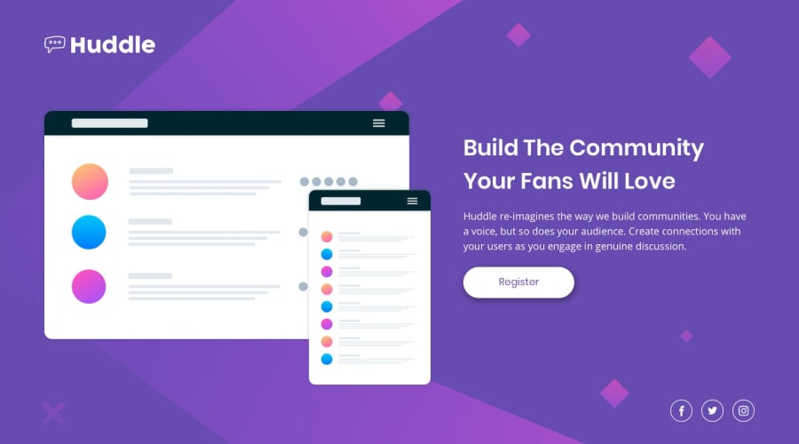
Design comparison
SolutionDesign
Solution retrospective
Any constructive criticism/ feedback is very much appreciated.
Community feedback
- @TXMack713Posted over 3 years ago
- Good use of the icons.
- Your paragraph spacing and sizing of the button is good.
- I would recommend enlarging the layouts image and positioning it to take up at least 60% of the width and reducing the width of the text container so that the verbiage isn't so spread out compared to the design.
I've been looking at the background image positioning myself and have tried various things on two different machines and 4 browsers, but have not been able to find a solution that has perfectly matched the design. I like your solution and look forward to seeing what else you create.
Marked as helpful0@darshii98Posted over 3 years ago@TXMack713 Actually, this project doesn't have to exactly match the design as it is a full vw covering project, so background wise, it's fine, doesn't have to match, but I will take up your consideration on enlarging the images. Thanks! :)
0
Please log in to post a comment
Log in with GitHubJoin our Discord community
Join thousands of Frontend Mentor community members taking the challenges, sharing resources, helping each other, and chatting about all things front-end!
Join our Discord
