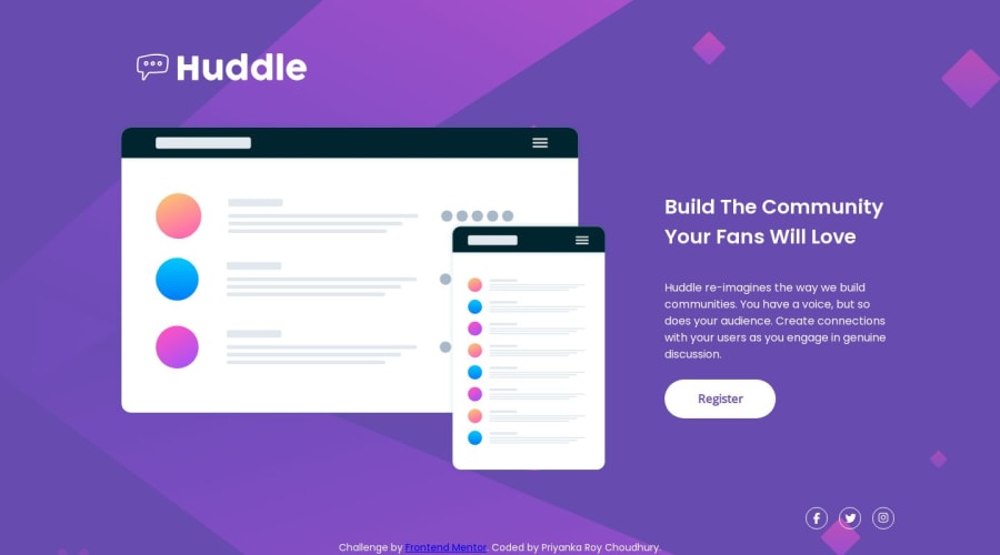
Huddle Landing Page using HTML and CSS
Design comparison
Solution retrospective
Hello everyone
I've encountered some challenges while working on the Huddle Landing project:
-
In the active state for the SVG social media icons, I struggled with adding stroke colours on hover. Currently, I've implemented a hover colour over the icon as a workaround.
-
During the inspection of my designs, I observed that the content in the "image-and-text" class is unevenly spread on certain devices. Despite attempting to set a max width, the issue persists.
-
In the mobile state, I aimed to position the Huddle logo to the left, but I couldn't achieve the desired layout.
I would greatly appreciate any assistance or insights you could provide.
Additionally, if you have any other comments or feedback on the project, they would be invaluable.
Thank you for your time and support.
Best regards,
Priyanka
Community feedback
Please log in to post a comment
Log in with GitHubJoin our Discord community
Join thousands of Frontend Mentor community members taking the challenges, sharing resources, helping each other, and chatting about all things front-end!
Join our Discord
