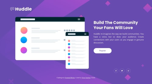
Submitted over 5 years agoA solution to the Huddle landing page with a single introductory section challenge
Huddle Landing Page using HTML and CSS
@VictorSanchez25

Solution retrospective
Hi! This is my 2nd challenge as of now and I hope you'd take a look at it to fix some issues or anything. Feedbacks will be much appreciated! Thank you.
Code
Loading...
Please log in to post a comment
Log in with GitHubCommunity feedback
No feedback yet. Be the first to give feedback on Victor's solution.
Join our Discord community
Join thousands of Frontend Mentor community members taking the challenges, sharing resources, helping each other, and chatting about all things front-end!
Join our Discord