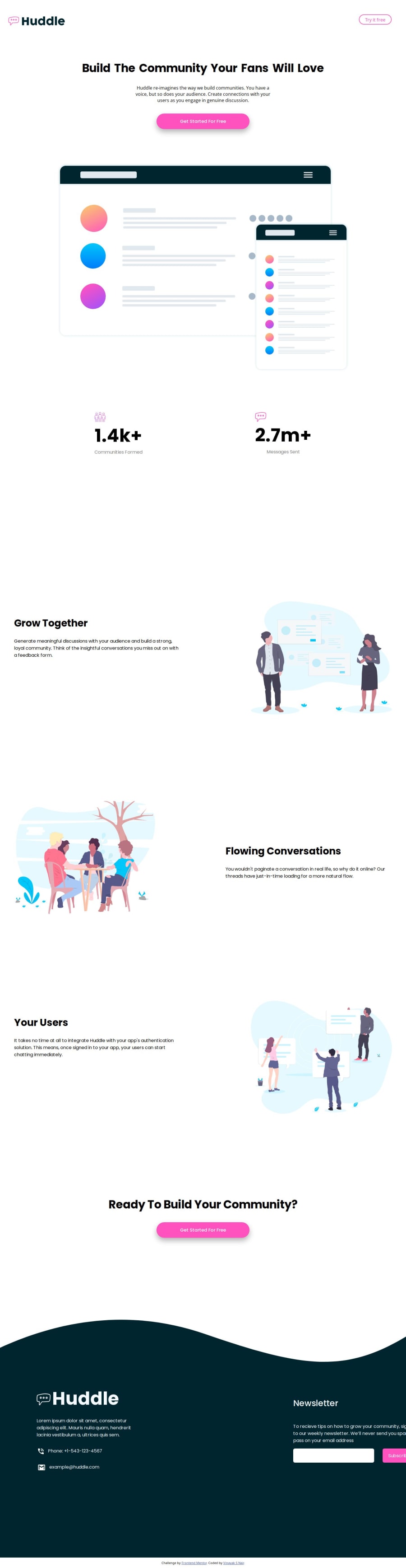


Design comparison
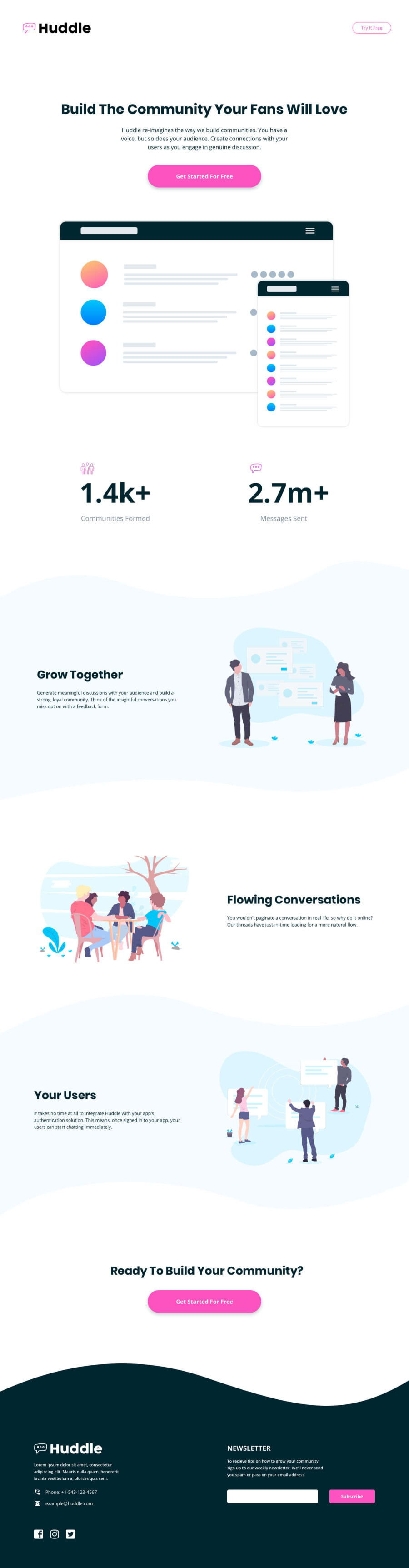
SolutionDesign
Solution retrospective
What are you most proud of, and what would you do differently next time?
I was proud that I got this done. I am saying this, because this challenge was more time taking than any of the challenges. I didn't organize the divs properly before hand, I just dived straight in to code.
What challenges did you encounter, and how did you overcome them?I zoned out while coding this, so I have no idea, what I did when I revisited what I wrote. I had no idea what I wrote but it was a mess
What specific areas of your project would you like help with?If anyone who would be taking their time to read through css code, there are a lot of mistakes on it, so if there is any suggestion which reduce the number of lines in it, really appreciate the feedback.
Community feedback
Please log in to post a comment
Log in with GitHubJoin our Discord community
Join thousands of Frontend Mentor community members taking the challenges, sharing resources, helping each other, and chatting about all things front-end!
Join our Discord