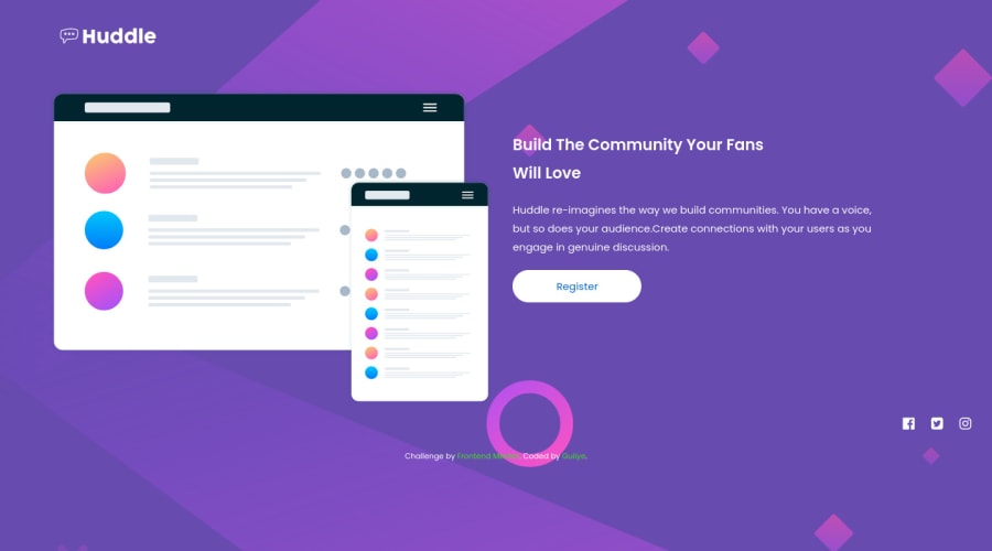
Design comparison
SolutionDesign
Solution retrospective
made some changes to the initial one
Community feedback
- @ovidiuantonioPosted about 4 years ago
Hello Guliye,
You did a nice job on this challenge! I have a few tips for that'll help you improving your solution:
- replace the current width of the .container with
max-with: 90rem;to keep the content in the center of the page, you can also do that with the header but don't forget to addmargin: 0 auto;or you can add all the elements inside one div that will havemax-width: 90rem;andmargin: 0 auto; - add hover states for the footer links too, for a better ux, and try playing with transitions for smoother effects
- for the mobile version, don't forget to add
align-items: center;to align all the elements
Happy coding and keep going!
1 - replace the current width of the .container with
Please log in to post a comment
Log in with GitHubJoin our Discord community
Join thousands of Frontend Mentor community members taking the challenges, sharing resources, helping each other, and chatting about all things front-end!
Join our Discord
