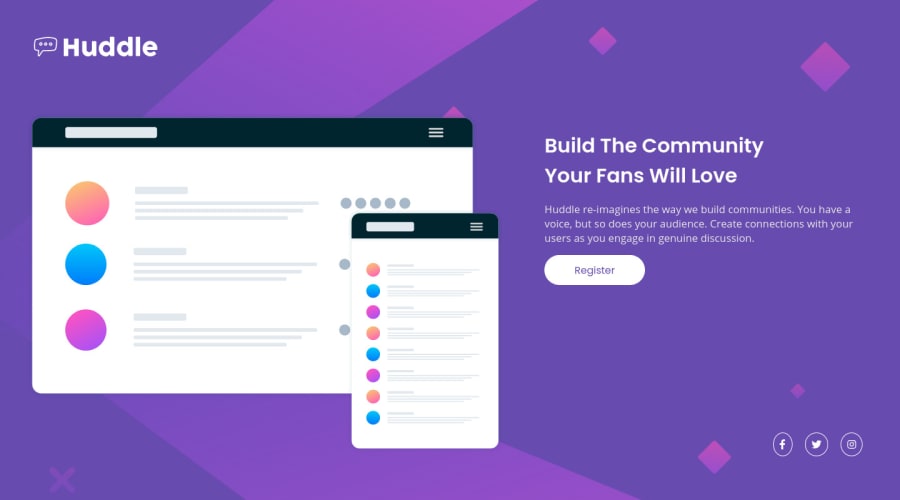
Design comparison
Solution retrospective
Hello !
Any feedback is welcome :)
Thanks you.
Community feedback
- @grace-snowPosted over 3 years ago
Hi
I recommend you take another look at your html structure. For example, what would you expect the button to do on a real site? Would it trigger navigation to a registration page? If so, a button is not the right element for that.
Similarly, what would the social icons do? At the moment they are just unlabelled icons. Should they perhaps be inside amother more meaningful element and be labelled?
I also recommend you add focus and hover states to interactive elements, and give the social icons a width and height as the Facebook one looks misshapen at the moment.
Looking at css, all is OK. But you could do this a lot shorter by relying less on percentage and viewport units to create the layout. I would start with the mobile design and have just one media query for larger screens when the layout has room to shift. Other than that, elements might have some padding and max widths but that's all.
I hope these ideas help you
1@SeyBooPosted over 3 years ago@grace-snow Thanks you for taking time to make this amazing feedback !
-
I change it to mobile first
-
Add a focus stats (i wasn't known that)
-
Add anchor tag (ups)
-
Change the shape of this icon
-
And my code is shorter
0@grace-snowPosted over 3 years ago@SeyBoo good job
You still need to
- remove the # from the image alt value
- add labels to those social links (eg aria-label) so assistive tech knows where those links go
1@SeyBooPosted over 3 years agoThanks you !
And thanks again for your response i wasn't knoing the (aria-label) normaly everything is good now !
0 -
Please log in to post a comment
Log in with GitHubJoin our Discord community
Join thousands of Frontend Mentor community members taking the challenges, sharing resources, helping each other, and chatting about all things front-end!
Join our Discord
