Design comparison
Solution retrospective
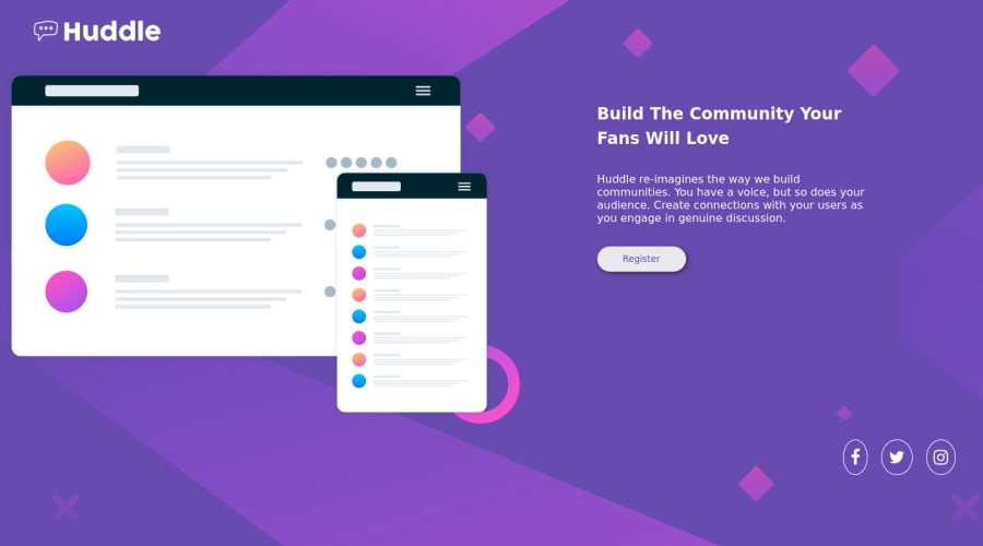
Hi, this is my solution for the huddle landing page. I had some problem with spacing of the right text content and the left illustration. What should I use? Border box? Also how can I make the icon borders a complete circle. For facebook it seems a little cramped. Any feedback is welcome...thanks! :D
Community feedback
- @mohamed-benoughidenePosted about 2 years ago
for your question how can I make the icon borders a complete circle? the easiest way is that you give a different padding values to every icon because they have different widths and heights . the odder way witch is a little bit complex is that you go to figma and use font awesome icon plugin and add the circle there then export it as SVG then you have to use it as SVG element and edit it using CSS.
i created this example on codesandbox :
https://codesandbox.io/s/upbeat-bhabha-k5rlmy?file=/index.html
for me I prefer using the first method because its the easiest and the fastest just check my solution for this challenge and you will find that I used a different padding values.
finally, I hope you find my feedback helpful if so please upvote me and mark it as helpful π.
Marked as helpful1@arushkumar05Posted about 2 years ago@mohamed-benoughidene I will check your solution for the different padding. Thanks a lot for your suggestion!
1 - @correlucasPosted about 2 years ago
πΎHello Arush, Congratulations on completing this challenge!
Here's some tips to improve your solution design:
1.The SVG background is not properly applied, to fix that first you need to add
background-size: no-repeat
(to avoid it repeating) and then addbackground-size: cover
to make it fit full width and vertically aligned with the card.2.Fix the alignment of the whole content using
flex
andmin-height
to manage the vertical alignment and make everything centered.First of all putmin-height: 100vh
to thebody
to make the body display 100% of the viewport height (this makes the container align to the height size that's now 100% of the screen height) size anddisplay: flex
eflex-direction: column
to align the child element (the container) vertically using the body as reference.body { background-color: hsl(257, 40%, 49%); background-image: url(./images/bg-desktop.svg); box-sizing: border-box; background-repeat: no-repeat; background-size: cover; }
βοΈ I hope this helps you and happy coding!
Marked as helpful1@arushkumar05Posted about 2 years ago@correlucas thank you so much for your feedback Lucas. I will implement these to improve my design!
0
Please log in to post a comment
Log in with GitHubJoin our Discord community
Join thousands of Frontend Mentor community members taking the challenges, sharing resources, helping each other, and chatting about all things front-end!
Join our Discord