Design comparison
Solution retrospective
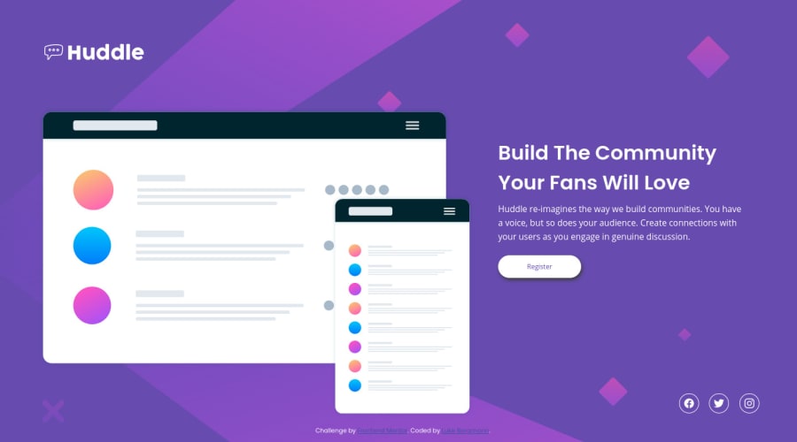
Please feel free to go through my code and let me know if there is anything I am doing that is either slowing me down, or making my life harder than it needs to be. I am having a bit of trouble still laying everything out. I am also having a problem with everything shifting around when I make the website larger or smaller. I could use a couple of pointers!
Happy coding, Luke
Community feedback
- @ApplePieGiraffePosted almost 4 years ago
Hey, Luke! 👋
Good effort on this challenge! 👍
As MasterDev333 suggested, it would definitely be worth looking into learning and using a layout method like flexbox to layout your projects. This will help you avoid the trouble of positioning all of the elements on your page with absolute positioning (since that can become rather tedious and prevents your design from being very responsive). You can also group related elements in containers and then position those containers within the page and the elements within them differently to speed up your workflow and improve the overall neatness of your layout. 🙂
In addition to that, don't forget to turn the social media icons at the bottom of the page into actual links! 😉
Keep coding (and happy coding, too)! 😁
0 - @MasterDev333Posted almost 4 years ago
Hi, Luke. I've checked your solution. You've done everything using position: absolute, but it couldn't be. I suggest you check other solutions and you may get some idea from it. You should use Flexbox to arrange items in this challenge. Hope you find the right solution. If you have any problems, DM me on slack. Happy coding :)
0@lukebergmannPosted almost 4 years ago@MasterDev333 Ahh yes, thank you. I am having some difficulty with laying things out and arranging them. I will use more Flexbox from now on!
0
Please log in to post a comment
Log in with GitHubJoin our Discord community
Join thousands of Frontend Mentor community members taking the challenges, sharing resources, helping each other, and chatting about all things front-end!
Join our Discord