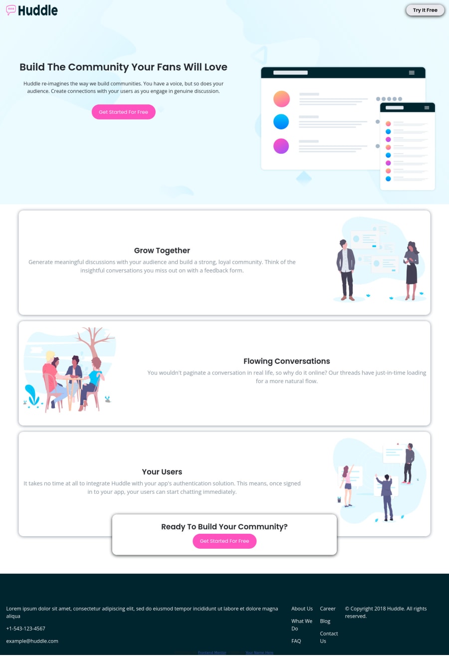
Design comparison
SolutionDesign
Solution retrospective
Thanks for any review!
Community feedback
- @tesla-ambassadorPosted over 2 years ago
Hey Whitehatns. This is some awesome work you've got here! It's response is smooth! Here's a few pointers:
- You should consider incresing the padding of your header to your logo and nav from being so close to the edge of the screen. On this note, I'd recommend that you wrap your logo in a div to prevent the image from looking stretched out when your apply certain properties like flex that may sometimes affect the width or height of the image but when the image is in a div, the div inherits it's width and height properties by default and therefore the image widht and height can't be affected.
- You should also wrap the divs with class "container" in a <section> tag and increase it's margin top to around 50px or 100px so that it can resemble the original design.
- You should also reduce the opacity of the box-shadow property to prevent the shadow from overstanding out. You could consider a box-shadow property of (
box-shadow: 0 2px 10px rgba(0, 0, 0, 0.3);) - You might also want to enclose your <div> tags within a <main> / <header> / <footer> landmark depending on the apppropriate part of your page to fix some of your accessibility issues.
- Also consider using a <h1> tag and using any other heading tags in logical order to fix other accessibility issues. In your case, your <h1> should be "Build the community your fans love" and the next heading tags could be <h2> tags, incase there is a sub heading, you should use a <h3> tag. Happy coding and keep up the good work!
Marked as helpful1
Please log in to post a comment
Log in with GitHubJoin our Discord community
Join thousands of Frontend Mentor community members taking the challenges, sharing resources, helping each other, and chatting about all things front-end!
Join our Discord
