Design comparison
SolutionDesign
Solution retrospective
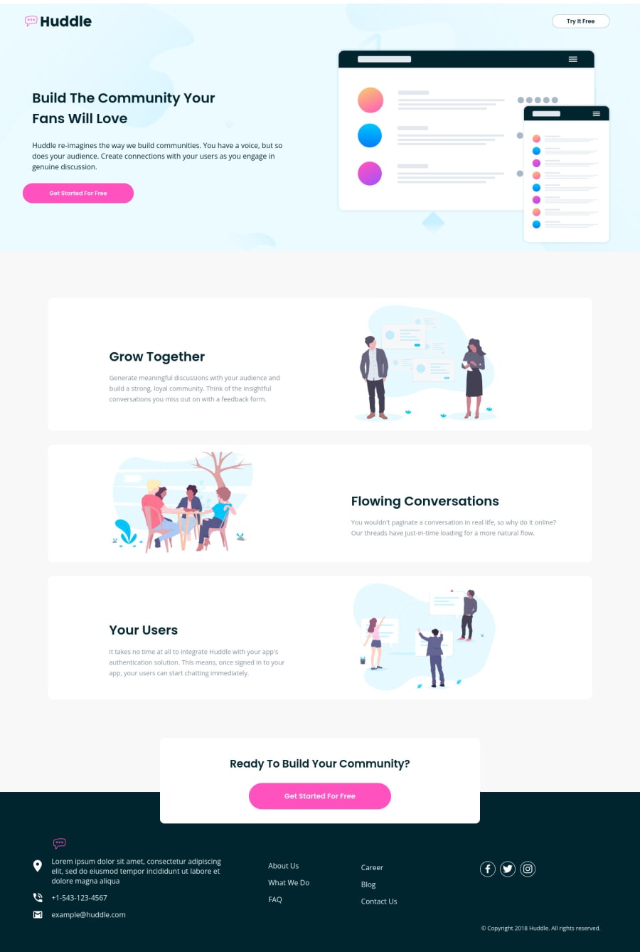
It took me a lot of time to do this project and I used a lot of code lines in my css. The background in the desktop view on my header doesn't fit like the original . I would love some advice from you guys.
Community feedback
Please log in to post a comment
Log in with GitHubJoin our Discord community
Join thousands of Frontend Mentor community members taking the challenges, sharing resources, helping each other, and chatting about all things front-end!
Join our Discord
