Submitted about 2 years ago
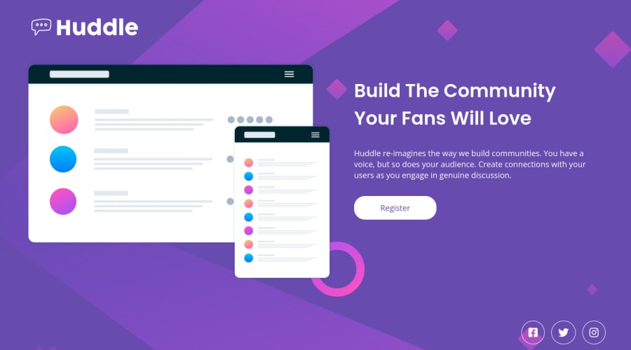
Huddle Landing Page Single Solution
@NationsAnarchy
Design comparison
SolutionDesign
Solution retrospective
It's pretty difficult for me to try matching the design for this one, apparently. Apart from that, it was a fun challenge for sure!
Community feedback
- @hmadamkPosted about 2 years ago
- great work
- to avoid unnecessary scroll in chrome reset your body like so
body{ margin:0; }- links must have describtive text for links with icons use aria-label to describe your link to non-sighted users and screen readers like so
<a href="#" aria-label="Our facebook page">- you shouldn't wrap your image with a section a div is more semantic for that
- I don't know about the pseudo-element or pseudo-class host thing but I will read about it
Marked as helpful1@hmadamkPosted about 2 years ago@NationsAnarchy you are so welcomed consider marking the comment as helpful it cheers me up, have a nice day and if you have any question about semantic html accessibility or javaScript feel free to ask
0@NationsAnarchyPosted about 2 years ago@hmadamk Not really sure why the report generating tool reads out those HTML issues, I didn't have anything related to those on my CSS codes. I think we are fine with that anyway.
0
Please log in to post a comment
Log in with GitHubJoin our Discord community
Join thousands of Frontend Mentor community members taking the challenges, sharing resources, helping each other, and chatting about all things front-end!
Join our Discord
